I've finally started working on an actual game. The programming is not a problem but art, on the other hand, well...there be dragons.
I'm not an artist and it doesn't come naturally to me but pixel art, 8x8 pixel art in particular, seems much more approachable than more traditional types of art. I think because the feedback cycle is shorter and more obvious: with only 64 pixels to play with, it's pretty obvious when you put one in the wrong spot and there are a limited number of choices available for how to fix the problem. So I spent a few days poking around the sprite editor doing a bit of an "art study" to see what I could figure out. Comments, tips, tricks, etc. very much welcome.
This is very much not a tutorial. I'm not and artist and I'm not qualified to teach anybody anything about doing art of any kind. If people find it interesting or useful, great! But mostly I'm just using this as a place to record observations for future me to think about when I'm trying to figure out what the heck my game should actually look like. I'll add the full sprite sheet at the bottom if anyone's interested in having a look at it.
Basic proportions
One of the things I remember from my many failed attempts to learn how to draw is that people are generally about 8 heads tall, which seems ideal for an 8x8 box. One for the head (duh), three for the torso, and four for the legs, with the hand hanging just below the waist. Sketching that out as a sort of measuring stick, I got this:
|
|
[8x8] |
Trying to make that into a front view though presented immediate problems:
|
|
[8x8] |
The shoulders are a bit too broad compared to the head but the main problem is the pogo-stick leg. So obviously I had to mess with the proportions a bit to get something that looked acceptable.
|
|
[8x8] |
|
|
[8x8] |
The legs had to be shortened to allow for the larger head but at least now I get hair! This is, I think, probably about as close to "proper" human proportions as it's possible to get inside and 8x8 box.
Messing with proportions
Alright, so how does it change if I mess with the proportions further? Maybe other people will read these differently than I do but here's what I've got:
-
Extending the torso an additional pixel gives him a solid, football player-ish kind of feeling.

[8x8] -
Making the legs one pixel longer, on the other hand, gives a more prim and proper, possibly slightly
stuck-up vibe.

[8x8] -
Lowering only the shoulders gives him a "stylish" turtle neck.

[8x8] -
While making the head larger makes the character feel a bit more heavy-set. Especially if the torso is
also extended an extra pixel making the legs shorter.

[8x8] 
[8x8] -
I did a couple characters at 8x16 with the same basic proportions where each pixel in the 8x8 becomes a
group of 4 pixels in the 8x16 which can then be edited to keep the proportions more in-line. Didn't do
many of these though

[16x16] -
And then, of course, with a bit of understanding of the proportions and how to balance them, I went for
the big-head, small-body look. I tried a few variations:

[8x8]

[8x8] But eventually ended up with this cute little guy. With a whole pixel of headroom to spare!

[8x8]
Animation
Okay, so I'm getting the hang of things but now I need them to move. I went back to my original "measuring stick" guy and tried a walk cycle.

Not too bad. The torso stays straight up and down so I also tried angling it forward and backward to see how that changed the feel of the walk.


The forward tilted one feels like it moves faster, even though it doesn't, and feels like it has more of a sense of purpose about where it's going. The backward tilted one feels slower and like it's ambling, lazily, almost clumsily from place to place. Honestly, I feel like I could do almost anything with the legs and as long as I've got that bit of a head bob and the arm swinging, it'll pretty much read like a walk.
Tried the little cute guy next and even added an idle animation and played with the position of his head.

Feet don't do much. Still looks like a walk. Nice.
And finally, having just watched a video on sub-pixel animation I thought I'd give that a try in a small way by making a couple guys with weapons.


1-bit
I decided to try making 1-bit black-and-white characters because I'd have to figure out how to suggest shape and separation of body parts with as few pixels as possible since I couldn't use colour to distinguish the sections. Mostly just rehashed everything I did above but in black-and-white only but a few things I learned: The colour stick-guy walking looked okay in all three versions. In 1-bit, the forward tilt of the body was essential to suggesting the direction of motion. Everything else just looked vaguely off no matter how I tweaked the frames.

For characters with faces, outlining the head but leaving it open on one side worked best and, depending on the size of the head, eyes can go right up into the hairline or not. Also, I found for some reason that a black pixel behind the hand really helped to sell the idea of the hand hanging by the waist even though that black pixel didn't really represent a part of the character's body. More like just a shadow which helped to sell the idea of a hand there.
|
|
[8x8] |

And then, once I've got a general character I'm happy with I can always colourize the sprite if I want to.

|
[16x16] |
Textures
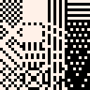
How do you make something look hard or soft? Rough or smooth? I have literally no idea. I started by just trying to sprinkle some random pixels around and try to figure out if it looked rough or smooth. What it looked like was a bunch of random pixels.
So instead, I created a few regular patterns, copied them and then made some tweaks trying to change the texture somehow. What I mostly ended up with were just a bunch of different patterns. I guess some looked rough and some looked smooth but mostly they just looked either more or less regular.

|
[32x32] |
As individual tiles they don't look like too much but some of them made nice patterns when tiled together. And I played around and found a few others that I liked as well:

|
[24x24] |

|
[24x24] |

|
[24x24] |

|
[24x24] |

|
[24x24] |
Didn't really get me closer to texture though. So here's the process that I figured out, basically applying a manual noise filter, that's giving me fairly decent results. I think, anyway.
I take copy of the "clean" tile and overlay some other pattern with a different colour. Usually diagonal lines but sometimes other patterns too, it takes some trial and error to find a good one. Anyway, once I've done that, I apply some rule like, "all grey pixels in the top half of the tile get coloured white while all the grey pixels in the bottom half get coloured black." That gives me a "dirty" tile which still has some recognizable structure to it but is a bit messed up.
|
|
[8x16] |
Tiled together on their own the dirty tiles are a bit too messy but mixing a few clean tiles in with them gives the eye enough to pick out the underlying pattern and make sense of the whole thing.

|
[24x24] |
And then, just like with the characters, I can colourize them later. Here are a couple I quite like. Though I make no claims that my colour choices are any good or that these are great or anything. But, I think, not a terrible starting point, at least.

|
[24x24] |

|
[24x24] |

|
[24x24] |
So that's the beginning of my pixel art journey so far. Still much to learn but I'm starting to get a handle on it.


it seems that images are missing!
wonder if that’s from the server outage the other month.

Thanks @merwok, I'd not noticed that the images had gone missing. I'm not 100% sure that I put back all the same images that were there originally but it still gets the idea across, I think.
[Please log in to post a comment]


