Hi,
A soon as I got Pico-8, I wanted to remake one of the Amstrad CPC games I played most in my teens: Who Dares Wins 2. Of course there will be differences from the original, but here are the things I liked most and would like to keep:
- Fixed screens (no scrolling). It gave a bit the feel of a puzzle game, with each screen having its own gameplay. And once a screen was cleaned, it was suddenly calm, with a bit of imagination you could almost hear birds chirping and you had time to explore as if there was something to do... which was not the case. But that might change.
- The ability to enter buildings. Well, it was more ruins than building. And it didn't quite look as if the dev planned that. Plus, again, there was not much to do, but that may change too.
- Then come the outposts! Frantic action! Mass murder! Be a hero!
- Saving some friends from execution. After all, we're the good guys.
- Launching grenades and picking ammos.
- I liked how it looked both on color and monochrome (green) screens. Well that was true for most Amstrad games. That means I plan having the possibility of remapping colors to play any screen versions (including more exotic grey and amber monochrome versions). Well, there are not much green colors on Pico-8, as the original game was in mode 0, so with 16 green values. So, we'll see. Not the hardest part anyway.
There are also things I plan to change, because what's the point in fac-simile?
- Different levels of difficulty
- Saving a friend will give you a bonus life. Maybe that'll be the only way for extra life (none based on score like the original)
- When killed the foes will randomely drop ammo. The falling crates may stay too as getting to them was fun.
- More weapons for you besides the gun and grenades: machine gun, mines and, erh... lasers?
- Maybe limited ammo for the base gun too. If no more gun, you'll have to get close to a foe and kill him with you last resort knife. Kinda Counter-Strikey, eh?
- Mines. Well placed grenades will clean them. Chain reactions.
- Swamps. They were in the original, but here they'd slower you and make you an easier target.
- Nighttime, rain and snow; For the beauty of it and the consequences on gameplay (visibility, moving).
- Scrolling. Yep. I discovered yesterday a video of the game on C64 where each level (that is, between 2 outposts) is scrolling. But maybe I'll stick to no scrolling, for gameplay sake or if I use palette mapping in a way that brings issues with scrolling. Plus, scrolling makes the game look more like Commando and, well, WDW2 ain't Commando.
- Different AIs. I mean, the original game way with foes randomly walking and shooting is fun, but, well... let's have some elite soldiers!
- Artillery from both sides: your side will randomely drop bombs to help you kill ennemies, while your foes will target you more precisely. Any side they come from, they force you to keep moving, as they can all kill you. You'll really hate swamps.
- Entering buildings, and more widely background interaction. Free a prisonner for extra life, pick weapon, ammo, order artillery...
- Instead of several lives, maybe only one but with energy level. This point and the previous ones to give a bit RPG or adventure flavour to the game. While still a shmup first.
That may feel over-ambitious as I've only made one small pico-8 game, "Stuck!", for the 1st Collab16. Maybe it is, but well you have to start somewhere! Anyway the best will be to bake the essential cake first and add cherries later.
My rough development plan:
- Moving the main character, and have him firing.
- Differents enemies, their movements, AI, unfriendly interaction with player
- Backgrounds and levels
- Ordering the drawing so that things on top of screen are drawn first and stuff at the bottom last. Now I have no idea on that, as the people move freely and their position is pixel-precise. Would they be on a grid, it would be easier. Oh, that may be a clue.
- Music & SFX. Most probably the Great Escape theme for the menu, and either other tunes from the movie, or my own ones, or none.
- Menu. It'll be accessed with a long press on 2nd button.
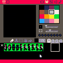
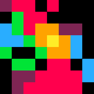
Well, let's begin and watch your little fellow move, ain't he cute?
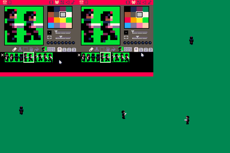
Anyway, while there's not much to see now, I'd really be glad to read about your opinion on that, your experience, what you think are DOs and DONTs... And of course whether you think or not that should be a cool game you'd like to play.

Have you played Broforce? It has a similar lives system where rescues get you an extra life, too. But once you're hit, your "extra life" immediately picks up where you left off with a tiny invincible window.
The extra weapons: what kinds of weapons could also have navigational utility, or interesting ranges that help attack places you normally couldn't? What do you think about armor pickups, which may protect you from stray bullets, but not explosives or stabs/contact kills?
Pixel-precise movement may be fine; it all depends on what you plan to do with the screens/scenarios. But since object placement is per gridbox, you might have each movement begin by rounding your position to the nearest 4x4 px; to reduce unintentional clipping, while still allowing you to position yourself perfectly/deliberately.
Ikari Warriors did this thing where your shots cane from one side of your body vertically, and the grenades came from the other (the open hand). While it seems like mostly a graphical choice; it had important gameplay consequences, like being able to shoot around certain corners safely, relative to your position. Sure, they only implemented this detail vertically; but as a vertical-scroller, that made sense.
Not sure how fun swamps sound. Maybe they can slow you down, but ALSO you can take cover in them for a couple seconds to compensate for that? Changes up the whole concept, and I think that's kind of the idea there.
If you're going to have random bomb drops: a) give the player adequate warning to react. And b) keep that shit out of the swamps. I know, it'll be a thing to make the game tough; but is it a FUN kind of tough? Getting randomly bombed with relatively nothing you can do about it doesn't strike me as very fun.
I'd recommend at least 3 kinds of AI:
1) Patrols.
These are the randomly-moving enemies; but they're never too far away from a point of interest. Maybe a doorway? Maybe a powerup? Maybe a hostage? Perhaps they go to sleep every now and then, or change out (and some come late/early) or go to the bathroom? (If you add bathrooms, I mean...)
2) Pressure AI.
These start parachuting in after awhile (if you take too long on a level), or if you're spotted and "!"ed, ala Metal Gear. But rather than obstruct you, they drop in behind the player, and act as pressure to push the player forward.
3) Sniper Elite/Rival
A particular nemesis that appears once per level, in a very tricky location. Can snipe you if you take a wrong turn and get in their line of sight; and acts as kind of a "Where's Waldo" factor to your levels. Also, if your levels are timed, "they" can be the force that kills you from a time over. Creates a nice tension with the player, no? Might make a cool final or "extra final" boss, too. I guess you can call her Waldo, but that's a little weird. ;) "Waldo" here is effectively, the one-per-level strawberry that you get bonus points/bragging rights for killing every level; but is completely optional.

More than cute. You have truly mastered PICO's 16-color palette.
One DON'T I can suggest is, don't use proximity to determine edges and contact of objects and items. Use a grid say, 8x8 in size for the player to move in modulos steps of.
This should save you a lot of troubles later.

^This is why I was saying to begin every movement by a rounding off to the nearest 4x4 px.

Thanks for your replies guys!
I've not played BroForce: it sure looks like a cool and fun game, but also a tough one. It's on my wishlist, waiting for a sale so I'll regret it less when I'll stop playing it by frustration :).
There were swamps in the original game, they were hard to see and killed you instantly if you stepped in them. I thought that making them slowing you down so you're more vulnerable to bullets and bombs made more sense and would affect your life expectancy less drastically. I'd also like to make the player drowning slowly if he stops walking. But that drowning part will work only if I stick with the multiple lives scheme, instead of only one life with energy bar. I'll also have to find an easy way to partially draw a sprite, that may also be useful on eventual snow levels.
While I don't think using them as cover for the player, offering protection to player is a great idea. I think making him auto-hiding when close to a rock, and uncovering when shooting, might be fun.
Your differents types of enemies are totally what I thought too, except I didn't come up with the parachuted guys which is an awesome idea. For simplicity they'll probably come sliding down from vertical ropes tied to unseen (but hearable) choppers, like Schwarzy guys at the beginning of Predator.
I also thought of pills that could gave you special abilities in a limited time: walking faster, or to the opposite slowering down everything except you: ennemies, vehicles, raindrops... But maybe that's where the remake goes too far from the original. And again, all that is secondary. I don't know well Pico-8 limitations (and mine :]) so I'll first stick to the main game and see later for all those extra parts.
About collisions: in WDW2 there were none between the player and enemies, and I found it funny, a bit Pythonesque: they try to kill each other with weapons, but each one ignores the others when passing by, as if they were blind but kept shooting. So there probably won't be any collision between ennemies & player, and that will avoid groups of stuck people! But yes, I'll have to simplify collisions between guys, bullets and background by placing pixel-positioned elements on grids (I'm thinking 8x8 cells over 4x4 as it'll fit background sprites). And this grid will also be useful when drawing moving elements from top to the bottom, as a lower element is in front of an upper one. It should be easier and faster than sorting sprites by their Y position.

I've never played the original game but it sounds like Metal Gear or something, pretty interesting. I'm liking the 8 way movement and you've done a really good job on the character's sprite but I'm just thinking that you could run out of sprite space really fast if you're going to add enemies, world objects, etc. :/
can't wait to see future updates!

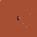
WhoDares? v 0.0.8: now you can shoot. Plus, a totally new background! :] Use fire1 (c) for normal shoot. Fire 2 (x) is machine-gun, well as you guess I was just playing with the pause between each shot. Still have to tune this: the pause is ok if you keep pressing fire1, but if you repeatedly press the button there should have no wait between bullets. I may have to tune the bullets frequency too, and add grenades as they're an important part of the fun. Hey kids, don't forget that's a game.
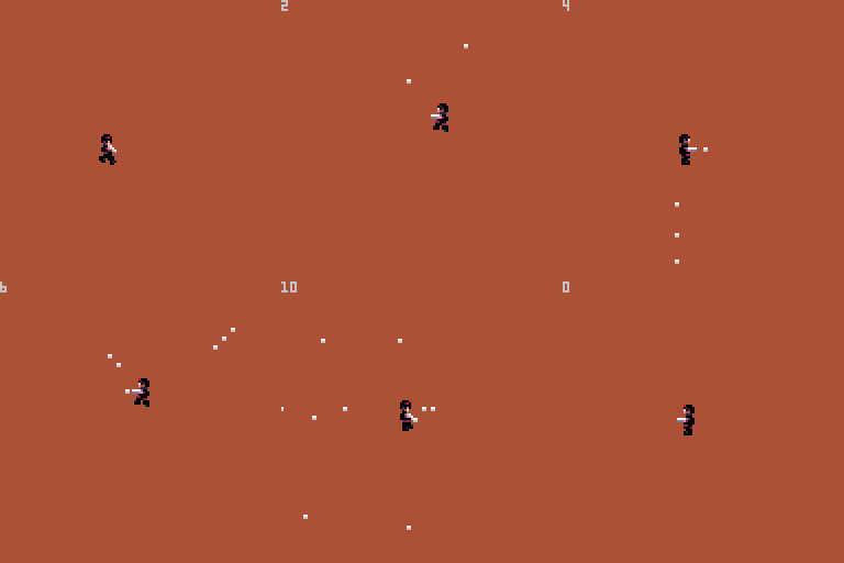
At first I used a noise sound (wave #6), but I like this one better as it's more cartoon-like. Kinda reminds the gun fight at the end of this fun 60's french movie "Les tontons flingueurs". The noise wave may come back for the machine gun.
Next step: add ennemies. So draw them from top to bottom whatever their position is, then make them move (first, stupidly), then shoot (stupidly as well).
@PixelCod, you're totally right about sprite space, that's the most worrying point to me. I'm optimistic though as since the beginning I put high hopes on palette work, as well for backgrounds (different places, weathers and daytimes) as for characters. That's the next step as said above, more precisely I'll check how to use the "pal" command to get different enemies, more like the C64 version (see YouTube link in my 1st post). And how to modify sprites to make visible some differences with some palettes. After all palette tricks suit well Pico-8 philosophy.

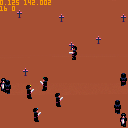
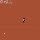
The current version is actually a mini-game. The challenge is to get enough bullets on-screen for the counter in the corner to reach 20.

Now working on adding ennemies and making them move. "Disco inferno" turn came in my player at the moment I launched the game to see this. That made my day.
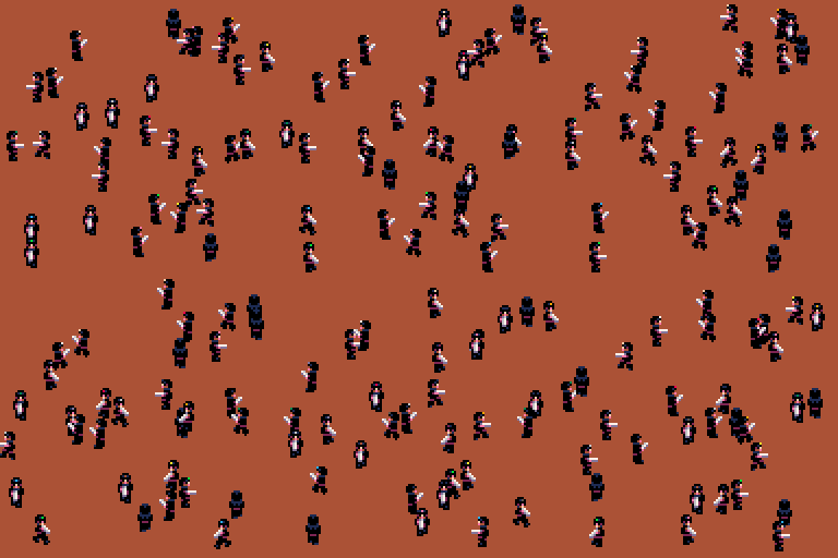

What's new:
-
Enemies added. Foes and player are kinda the same entity: guys. As they share a lot on the behaviour side, it makes things a lot easier, and can have nice side effects. For ex. in the original Who Dares Wins 2, there was a demo playing on the menu every 20 seconds or so. Here I can do the same just by switching the type "player" to "clever AI", instead of scripting the demo. But my object management is far from perfect, see "Next steps".
-
Enemies and player can have their own palette to tell them apart. Well for now it only shows on one pixel: the helmet insigna.
-
Enemies move on a rather dumb way: each randomely pick a direction (including none) and a duration. So contrary to original game they can pause, which feels more natural. Still, they're as dumb as in who Dares Wins 2. Put them out of their misery!
-
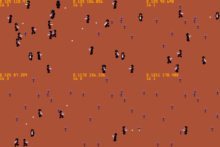
Sorted drawing. Since the game has a 3/4 top down view, sprites must be drawn from top to bottom, not in their creation order, so that a sprite in front of another is not drawn behind. The solution is simpler and better than what I thought earlier (see posts above): just maintain a 128 items table, one for each Y position and containing a sub-table for all characters placed at this position. X position doesn't matter. It's obvious once you thought of this.
- Now you can shoot unarmed foes! Which totally redefines the notion of enemies. It's totally between you and your morals. BTW the crosses are quickly made just to mark the guys "dead" state, not sure I'll keep them. In the while use them as you want to expiates your gratuitous unleashed power of destruction.
Next steps:
-
Real palettes to separate player and foes of different types. That doesn't mean the player won't be able to wear enemies uniform, of course :]
-
Better oop, as the code is sitting on 2 chairs, half object oriented, half functional. For ex. player and foes are all "guys" objects with common properties, but none functions are object methods, so we have some like guy_move(guy,px,py) instead of guy.move(px,py) or guy_kill(guy) instead of guy.kill(). Pushing it more into OOP would make the code more clean and maintainable.
-
Making the game a little bit more challenging. By giving guns to the foes, for example.
- Adding obstacles. That is, making maps and levels. Which are another worrying matter. Either Who Dares has its own editor and map management, which is a lot more work, of it uses Pico-8 standard maps. That means, if each level is made of 16x16 sprites, that there will be 16 levels only, where the original WDW2 on Amstrad had 27 levels. Or I use the extended map for 32 levels, and say goodbye to half the sprites. Or in between: 24 levels, and I keep an extra sprite bank instead of 2. The internal map editor seems the best idea though, because I like the idea of players making their own levels.
A side-note about the Pico-8 webplayer: as you can tell from my gif it uses half the memory and is twice faster than on desktop Pico-8. That's kinda strange, the opposite way would feel more logical.
As usual feel free to add comments and share your experience, I'd happily read them! That's why I'm rather lengthy and explicit on "Who Dares?" game development. I hope you find it interesting if not useful.

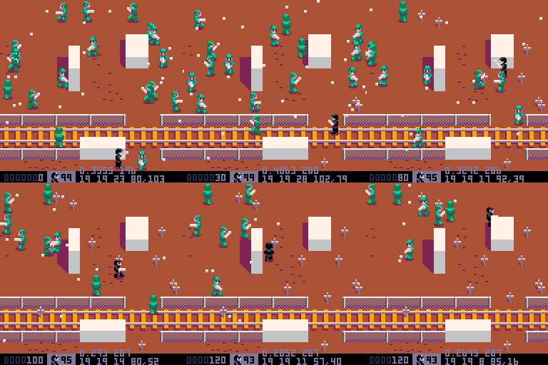
It's been some time, but I'm still working on it. Many new things were made on a PocketChip during a 4 days vacation mostly motivated by John Carpenter playing live in Paris. Many new things since previous version:
- Ennemies with their own colors
- plus, they now shoot, beware!
- lucky you, their AI is (I hope) close to the original game: dumb. They move and shoot randomly. Well, their shooting is not exactly random, can you figure how without checking the code?
- Map made with the internal editor, rather rudimentary for now. I plan having 24 levels.
- Collisions (with map and bullets only, there won't be between characters)
There are quite a lot of ennemies, can you get rid of them all without losing a life?
Oh, and there's a surprise if you pause the game (P or Enter key). Enjoy it while it's here, I'm not sure to keep it later.
Well, there's still so much to do. Next:
- more weapons (grenades at least)
- smarter AIs
- the most important: gameplay choices. Will the game stick to the arcade feel and original WDW2 gameplay, with lives just decreasing with each bullet received? Or will it be RPG flavored with every friend you free joining your team, each with his energy level, speed, weapon for you to pick when your current character dies?
- and of course graphics (most are done), levels, interface...
Stay tuned!

This is awesome! I've been quietly waiting to see how you evolve your engine and this is great.
You got all you need to make a Pico-8 Commando game. I've been wanting to see a Commando-style game since I got Pico-8. It's been on my list of game ideas forever but I never felt like I had the ability to accomplish the style I wanted.
But regardless, can't wait to see what this evolves into...bravo!

Thanks for your comment morningtoast! There's a chance the game, unlike Commando, will have fixed screens, for various technical and design reasons. The main one being the original Who Dares Wins 2 on Amstrad CPC had fixed screens and I liked that, it brought a puzzle feeling and an identity to each screen. But it's a bit early to be sure, and I'm certainly not against adding a flavour of Commando or Ikari warriors with a scrolling.

I think the fixed screens would be very cool. Like you said, makes each location an identifier and you could note landmarks and such. Cool thing is you could also have X number of screens and arrange them randomly each play so the layout is different. Same landmarks, different order.
Just some thoughts...I'm not familiar with the Amstrad game you're remaking so it's cool either way.

From a long time CPC owner - this is shaping up really nicely, well done!
I also like Commando, and the scrolling (or lack of in Who Dares) gives a different feel. Some Amstrad games suffered from lack of proper scrolling but fixed screens can work well, and I don't see why it shouldn't here.

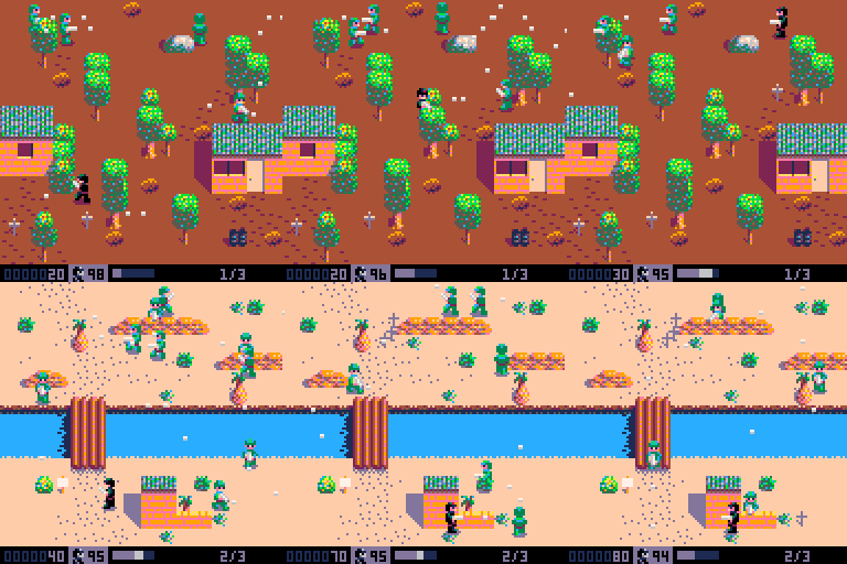
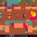
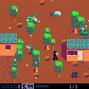
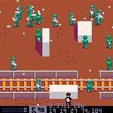
No, "Who Dares" is not dying, it relentlessly makes it path towards its goal. Still a lot of work needed, but it begins to look more like it, with 3, yes 3 playable screens, wow! The most difficult part is getting the 3rd dimension (height) just from the map editor and sprites tags. You can get an idea with "Show infos" from the [enter] menu (check the other option too). This, to get better collisions and make guys walk on different levels. Yup, kinda like in Chaos engine which is another influence. I wish Pico8 had a multilayered map editor.
Again, much more work needed, and still having a blast with this. So far, everything's done in Pico-8 except gfx which are made in Cosmigo's Pro Motion. See you soon!

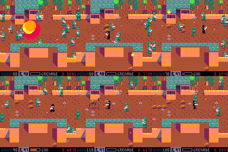
It's been quite a time. Yep, still working on it. A bit longer than I thought, and still far from the end of it, but still having fun too. Well there's too much new things to tell, so for short:
- Grenades with 2nd fire button, and plenty of it! Enjoy them before they get limited, but beware, they'll hurt anyone regardless of who fired them.
- Still rough levels, just here for testing stuff, and give a taste of what's to come.
- Better sprites drawing sorting, collisions, some sounds, and optimized enough to now play at 60 fps.
[Please log in to post a comment]


