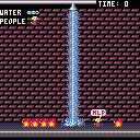
Oh noes! The fire had started at the Warehouse! And there are people there!
enter...
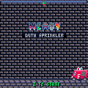
HEAVY DUTY SPRINKLER!
The ultimate AI, sentient fire extinguishing tool!
Control it with LEFT and RIGHT arrows and rain water by pressing Z!
Don't overdo it though, as water is precious and for any unit of water used, you'll have to hang on for another second before firesquad arrives!
You need to save PEOPLE, by putting out any fire that is WORTH 5 POINTS. Don't rain on people too much, as water is under HIGH PRESSURE and if too much of it lands on a person, it'll PEEL THE SKIN OFF!
After each LEVEL you'll be presented with screen that will show how many PEOPLE you SAVED (each of these worth 15 POINTS added to your SCORE!) and how much of WATER you used (not necessarily in that order).
For every SAVED LIFE you'll be saved 5 SECONDS of waiting on the next level!
I am not a big fan of my music.
Credits where credits due:
Wall tiles - Connorses
Floor tiles (modified by me) - nineraser

Oh, I've also tried to optimize it a bit so it uses less tokens.

The game logic is not done yet, is it? :) Endless water, endless fire ...

Yeah, it's not. That's why it's on 0.0.5 ;). But I've just made it so fire is destroyed. Will upload it tomorrow though since a) I need sleep, b) I want to implement water depletion.

I'm still not exactly sure what I'm looking at. Is this a wall or a brick floor? Why are all the fires and people at the bottom? Why is the sprinkler at the top and how is it moving? Gameplay makes sense but the graphics don't provide much context right now.

Sprinkler's on rail, people are on the floor, background is a wall.
//edit: If this would be a thing, I would be able to make better graphics, because default palette is awful and I could design better HDS graphics with better palette.

The default palette is not awful, you just need to use it correctly.

Yes, of course, I am the one who use it incorrectly, yes of course, master.

No way to tell when a random fire is going to instantly kill the human.

With so many examples which use it right, all completely different games with unique graphical styles and atmospheres, it's certain that there is a correct way to use it in almost every case.
Puzzlecave - Raiders Of The Lost Potato
https://www.lexaloffle.com/bbs/?tid=2039
Celeste
https://www.lexaloffle.com/bbs/?tid=2145
Dusk Child
https://www.lexaloffle.com/bbs/?tid=2274
Jelpi
https://www.lexaloffle.com/bbs/?tid=1810
Super Poulet Poulet
https://www.lexaloffle.com/bbs/?tid=2393
etc etc

+1 to Rhys. Maybe if you added some things to make it a bit less flat, like windows, vines, faded posters, etc...

Yeah the graphics are suffering highly from poor usage of the Pico-8's palette. Try practicing around some more with the colors and maybe you'll make something that is more recognizable.
Also, I'm not sure exactly what sort of feedback you're looking for. You seem to be aware that it works the way that it does, it looks the way that it does and that it's incomplete and you need to do more to it.
What exactly are we supposed to comment on, just out of curiosity?

I need mostly gameplay feedback/bug reporting, so it can be fully realised - this is my first Pico game after all. I'd love if someone would analyze game's code and give me tips on optimizing it, both speed-wise and token-wise.

Still not real interesting, since it doesn't change at all as you work to put out fires. Make somethin' happen!
P.S. Having a dark background speckled with 2 much lighter pixels is a little hard on the eyes.

Yeah, I know it's not interesting but:
a) This is my first P8 game
b) It's unfinished
As for making something happen, next version will have gameover screen when all people die (and maybe more levels).
As for your P.S., you have Pico's palette to thank for that - hard to make bricks that are a) gray, b) shaded.

You might want to try to make your graphics less detailed. The decision to have detailed graphics and tiny sprites has made your life more difficult trying to draw detailed bricks with limited colours.
Try a solid grey wall.
Try bigger bricks.
Try different colours.
Try bigger sprites.

@darkhog take to reduce your all palette to 4 colors,or even 2 ( black and white)
I'm pretty sure the result will be much better.
In term of gameplay , it remind me the Game & watch games, but I think you need a sense of rhythm to make it fun, at the moment it just feel random.
Good luck

Protip: Don't develop for an engine with a limited palette that you don't like the palette of.

I think you're still lacking contrast, the whole screen is hard to read.

Hi Darkhog,
I think the Pico-8 palette is perfectly sufficient for a game like yours.
Sure, the predefined colours have their limits, but there is plenty of beauty in them.
My advice would be that you try to embrace what is given. You might be surprised what can be done with just a handful of colours...
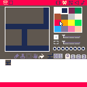
I took the liberty to download your cartridge and repainted a few tiles to demonstrate what I mean by this:
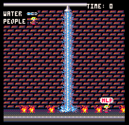
I take it from your comments on the palette thread that my usage of colours here might not be what you had in mind when you started developing your game, but this is visually exactly what can be done easily within Pico-8's limits... And I hope I can encourage you to further explore the possibilites of a constrained platform instead of fighting it.
I think your game has potential. I'm looking forward to playing the final version!
Keep up the good work.
Cheers!
gizmo^hackefuffel

Thanks. I'll probably use wall graphics, but rest stays the same. Can't use these water graphics because of how water checking works (if you downloaded my cart, you know the details). As for fires, I like mine better and if not for the water beam, I'd think your sprinkler sprite is some kind of lamp.

Your sprinkler looks like one of the aliens out of Williams Defender, so a lamp like sprite would be a huge step in the right direction either way.

It's strange, but I find it's easier to make a "gradient" if you are okay with using an array of colors, because if you only want to use the pure greys in PICO-8 it can be difficult. One grey is dark, and another is bright, and the background can't be both dark and bright because then it's hard to see everything else against it. You could get away with using PICO's dark blue/purplish grey in the bricks as a third color, for instance, without breaking up your style.

The solution for middleground shades in pico is to use the less saturated colours, like the purple and dark blue. Using them correctly makes the graphics have a lot more character as well (slightly blue walls instead of boring gray, colour ramp instead of straight gradient).

^
Rhys explains it pretty well.
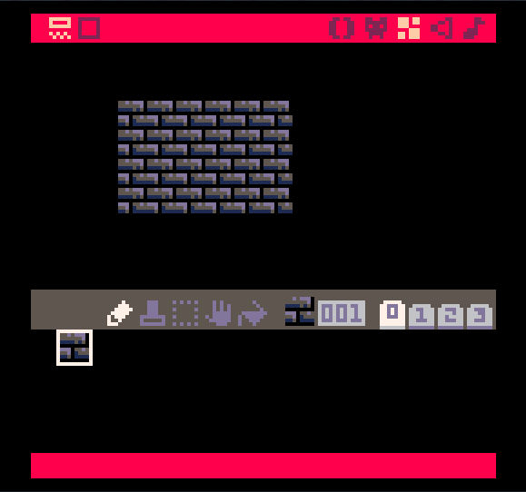
I suppose the palette is literally designed to make it harder to make games with dull, boring colors. Even my "grey bricks" here have some blue or reddish tint because that's the colors I had to choose from. amazed face

Hey Darkhog,
sure, take what you need and leave the rest! Here is the cart:
Cheers!
gizmo
P.S.: @Connorses, really nice looking wall!

New version. Don't take it the wrong way, but I've used Connorses' wall in the end as it is more in the line with my vision of the game.

It's getting closer and closer to the final release! Working on level progression and win screen right now. Current token usage: 1759. Definitely too much. Will see if I can get it down.

Win screen is almost done, now I only need to make it go to the next level.

It's done! Still need playtesting tho, so it's not 1.0. I'll also try to sneak in some easter egg.

More or less finished version, updated few graphics and fixed minor placement bug on level end screen.

Added happy firemen (because they don't have to extinguish any flames, lazy bums ;)) at the level finish screen because it felt bit empty.

Moving to complete carts and changing the OP to reflect that. Will probably version bump it to 1.0 in the evening if I won't forget as there are no major bugs and any further additions will be just icing on the cake (if any).

Version bumped to 1.0, added splash screen logo and fixed critical, "death screen" type of bug - after level 12 flames stopped spawning.
See? I would fix it earlier if I would know about it. And I would know about it if anyone actually bothered to play this and tell me about the issue

Heh...

Just one thing, you can tap the sprinkler button to instantly extinguish flames for barely any water at all. It's pretty hard to lose unless you get really unlucky with fire spawns. The dancing firemen are a cool addition.

That is by design. Also every 12 levels spawn rate of flames is getting higher (but no faster than 1 flame per second) so eventually, you won't be able to just tap the sprinkler. Actually increasing spawn rate and my omission in code is what caused that bug I was talking earlier and fixed along with version bump.
As for firemen, well I had planned something like that from the beginning, thanks!

Nice game. I laughed at the game over screen when you hose the people too long.
My only nit pick is that the score screen can take a bit too long if you hold down the water hose for a significant period of time. It refills very slowly.

Even more reason to conserve the water!
Anyway, I'm still trying make this even better in my spare time so eventually I may patch it up.

The people tend to move away from the fire before I can put it out, meaning it's hard to really react to the fire and prevent people being burned. I suppose this is pretty hard to fix at this point, though. Good work figuring out the levels and such, anyhow.

Wouldn't you move away from the fire when it is right next to you? And the trick is to prevent too much flames, even when they're outside of any person hitbox otherwise when fire finally hit them (or just water), they'll go into a "death spiral", hitting each unattended flame until they're just a pile of dust.
And the levels are pretty much final, this is finished version. I may put in new update sometime that has changed graphics, but don't count on it.

Will be porting it to TIC-80. Won't leaVE Pico-8, but probably will spent most of my time with TIC.
[Please log in to post a comment]


