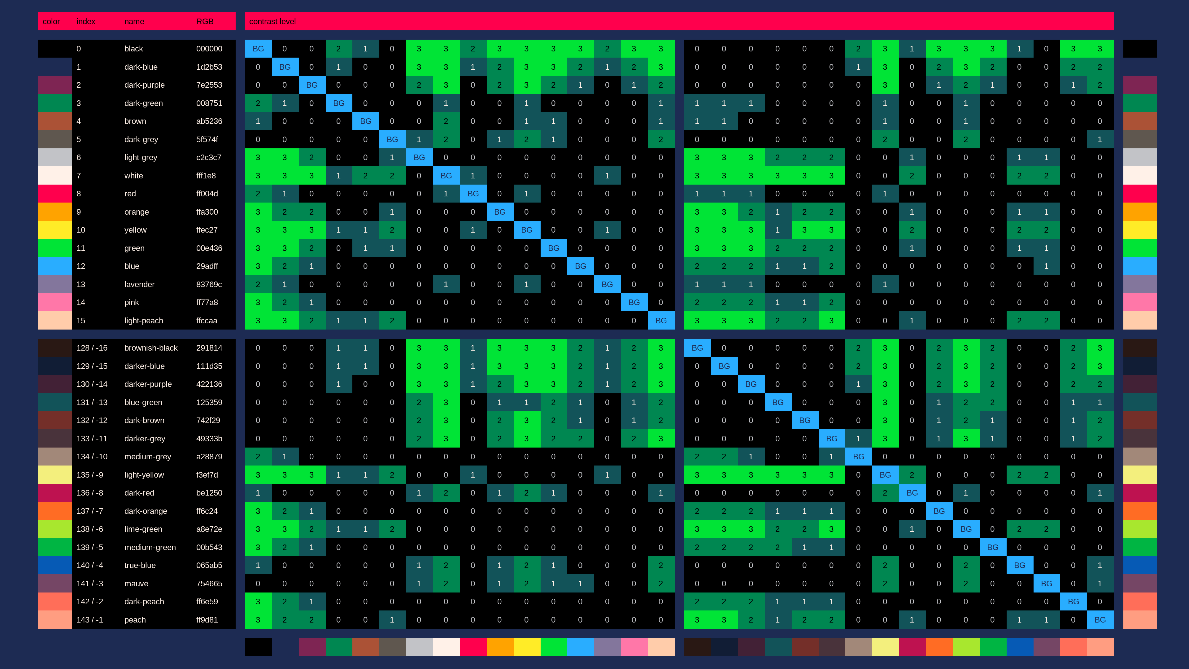
i will need to check the color contrast often when picking colors from the 𝗽ico-8 palette for future projects. so i made a color contrast table to make it faster than using the contrast checker:

you can find the contrast level between 2 colors in the table by doing this:
- start from one of the 'BG' fields, corresponding to the background color you want to try
- navigate straight up or down the color palette in the same column.
every field shows the contrast level of the color if used as the foreground color on top of the column's 'BG' color
the numbers from 0 to 3 are contrast levels. the higher the contrast level, the better the readability. the contrast levels mean:
| contrast level | description |
|---|---|
| 0 | ❌❌ nothing is readable. 𝗱on't use colors with contrast this poor unless you can't avoid it, or on elements that are just decoration |
| 1 | ⭕❌ graphical objects like icons and borders are readable. large text is also readable. normal-sized text is not readable |
| 2 | ⭕❌ large text is easily readable. normal-sized text is also readable |
| 3 | ⭕⭕ large and normal-sized text are easily readable |
💡 secret tip
the contrast between 2 colors is the same when you swap foreground and background color.
so you can not only use the 'BG' fields to pick a background color and the rest of the column to pick a foreground color:
you can also use the 'BG' fields to pick a foreground color, and the rest of the column to pick a background color
ℹ️ information sources used
- pico-8 color palette: https://pico-8.fandom.com/wiki/Palette#0..15:_Official_base_colors
- contrast checker: https://webaim.org/resources/contrastchecker/

nice work :)
the table would be immensely more readable with the top row being the colors!

𝘁hank you @freds72 for the instant feedback! :)
i added the colors 2 more times: once to the bottom and once to the right.
i hope this makes the table easier to read — it does for me
i couldn't add the colors to the top, because to put the colors on the top i would have to:
- put the colors between the column labels and the fields, which makes them look too separated
- or put the colors above the column labels, which makes the colors look too separated
[Please log in to post a comment]


