Dark Descent
Would love to hear your feedback
Gameplay
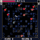
Move with arrow keys, attack with Z, pick up/switch weapon with X.
To win, defeat Diablo (boss of Room 6 of Act 6).
Weapon stats are: Power (damage), Reach (length), Speed (delay before strike) and Weight (delay after strike).
Weapon rarities are: Common (grey), Rare (blue), Epic (pink) and Legendary (Yellow).
Pay attention to spike traps, and be careful around statues!
Version 0.1 Changes:
- Reduced speed of elite enemies in later acts
- Added menu and victory/defeat screens
- Implemented score system
- Player will no longer spawn on top of enemies/walls
- Weapon swing flashes now properly match their hitboxes
Planned features:
- Music
- Different abilities for each weapon type
- Weapon upgrades
- Monster abilities
- Random names for acts and bosses
Credits
@Yolwoocle for smooth player movement system from Birds with Guns
Members of Pico-8 discord server for all sorts of help

Takes a long time to defeat a single opponent, @PrinceD. Suggest opening levels are 1-2 seconds of combat to defeat a single enemy. Then ramp up the difficulty from there.

This is really fun! Suggestion: acts should have different scenery and maybe other new stuff (e.g. diff. hazards/statues), as I found the game addictively fun, seeing the same blue background is kinda boring.

I think the later acts are too difficult and luck dependent. I always die at act 5 because the enemies are too fast and likely have a strong weapon that makes it really difficult to stop them once it happens. A possible solution could be to maybe have a speed cap on them so that they can be fast but not faster than supersonic speed or have them carry very weak weapons or maybe, if you're planning to implement abilities, have one where you're weapon does more damage depending on how fast the enemy is. Just throwing out ideas. I still find myself playing the game over and over again 'cause this is a really fun prototype! Just too difficult on later acts :)

Thanks for feedback! Working on the next version now, will definitely tone down difficulty.

This is pretty neat! I really like the combat system.
I have a few thoughts on the weapon comparison screen:
- The background sometimes makes it hard to read the numbers. Especially if the numbers are red, and there's blood/enemies immediately behind.
- The player doesn't need precision to the last digit. If you round them (e.g., to the tenths place: 12.3 instead of 12.3456), it might be more readable, and easier to mentally compare the two numbers as well. It would also help readability if you aligned the numbers on the decimal points (ones in the same column, tens in the same column, etc).
- I like the color coding, with red = worse and green = better. It might also be nice to have a visual indicator of how much better/worse a given weapon is, like
12.3 *if the numbers are more than 10% apart,12.3 **if they're more than 20% apart, etc. Those percentages might not work, and it might add too much clutter to the screen -- may or may not be a good idea. - It would be nice to have names for the weapons, even if it's something as simple as "common spear" or "epic sword".
Sorry if this is too much feedback! Despite my quibbles with the weapon comparison screen, the game as a whole is really fun, and I keep on coming back to it. Looking forward to 0.2!

Thanks for feedback, @cmounce!
In the much delayed new version I actually implemented some of your suggestions. Also, the game is now possible to beat.
[Please log in to post a comment]


