Hey All
I'm in the process of simplifying the website a little. In particular, I wanted to improve the experience of playing cartridges in threads by removing clutter. They now look more like a page dedicated to the cart:
- The player starts open
- There's a big obvious play button and large thumbnail
- There's no banner at the top of each page

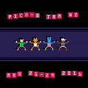
I removed the PLAY buttons from the thread previews, and autoplay, as I think they're no longer needed -- the whole playable region of a cart is now visible without scrolling after opening the cart's thread, and it's more obvious to new visitors what to do next.
There are still a few small things to finish, but let me know what you think of the new layout, and if there's anything that bugs you.

I don't know if this is a bug or not, but the header image for PICO-8 is gone :( With out the header the whole website feels weird.

could the audio button be added somehow? there's no way to mute the game anymore :/

I like the new cart area. One suggestion... The mute, fullscreen, pause/play buttons are a little distracting. I, personally, would prefer them outside of the black square. Or hidden unless moused over, but then you'd have trouble getting to them on a touch screen.

@Ivoah it felt weird to me too at first, but give it a day or two! There does need to be something more obvious that points 'home' to PICO-8 though. For someone passing through the site, it's hard to figure out what they're looking at at a glance. It might just be a matter of having some kind of banner, but putting #p1234's at the end of the thread links.
@davidalvertainley The audio, fullscreen and pause buttons show up once the cartridge loads (to lazily work around a technical barrier -- I need to make it possible to start with the sound off)
@JakeCarter Agreed that they're distracting. Plan is to make them a dull colour and brighten when moving the mouse in the player area. But if that doesn't work, there's still space on the bottom right below the player. I'll try to keep the inside first though, because it means the interface can be more consistent with the planned embeddable iframe version.

I'm not seeing any of the buttons (mute, fullscreen, etc.) anymore, even when the cartridge is playing...
(in Chrome on Linux)

Do you have any plans to add virtual pads or somesuch so folks on mobile phones can play? I would v love that...

I liked the header image because it felt like an anchor or backdrop the the whole page, some big part of the site that was constant across pages.
EDIT: bug report: the pico-8 button in the top left menu isn't as large as the others (the highlighted background doesn't fill the whole bar) I'm on chrome on OS X


I would personally prefer, that the top menu (the one with the icones, the link to our profile etc..) to stay fixed on the screen, aka that it does not scroll, I'm lazy and on long thread, I need to scroll back to the top, to get access to them... ;)

I like the redesign. I spent some time tweaking the generated HTML and I think it may be more efficient to draw a 128x128 canvas and resize it using CSS. Black borders can be added with the margin or border CSS properties. Telling the browser to keep the pixels effect, and not antialising it, can be done in a cross browser way using CSS:
canvas {
  image-rendering: -moz-crisp-edges; /* FF 6+ */
  image-rendering: -webkit-optimize-contrast; /* Webkit */
  image-rendering: pixelated; /* Blink */
  -ms-interpolation-mode: nearest-neighbor; /* IE 7+ */
}
|
I'd also recommend to set the 'imageSmoothingEnabled' property to false on the canvas context like this:
// with canvas being the DOM element
var ctx = canvas.getContext('2d'); // Ideally, inject it at this instruction on the JS file.
['imageSmoothingEnabled', 'mozImageSmoothingEnabled', 'webkitImageSmoothingEnabled'].forEach(function(prop) {
  if (prop in ctx) {
    ctx[prop] = false;
  }
});
|
I'm not sure what's the best way to inject this code in the generated JavaScript file though.
Lastly, the canvas used by PICO-8 doesn't have any transparency. We can tell the browser about and it may optimise rendering time. Replace all the occurrences of:
canvas.getContext("2d")
|
by:
canvas.getContext("2d",{alpha:false})
|
in the JS file generated by PICO-8.
That would be nice to have these optimisations in place here.

I like being able to type in a thread after playing a game. (chrome, so I'm missing buttons, but I feel like it's net positive even with that)

@molenHD
yes -- in fact, that is one of the reasons I'm reworking the player now. The plan is to have a wee fold-out vertical control pad underneath.
@Ivoah
I caved and put the banners back :) I think they are still nicer now though, above a single menu bar.
@edo999
Nice one. I'll have a look at those, thanks.
Still working on fixing the buttons under Chrome, but they'll be back soon!

- Moved the mute/fullscreen/pause buttons to the bottom right -- should work in Chrome now too
- Added parallax to the banners and made them slightly thinner
- Added tips to the like / favourite / resolved buttons
[Please log in to post a comment]


