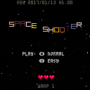
I decided to learn pico-8 and this is my first attempt at a game. Many of the components of this game have come from posts and ideas in the forum. The main inspiration was the shooter in 16 gifs. The music is also from another cartridge -- credit given for both in the code and in the scrolling credits.
I haven't tested this out on different devices yet... so let me know if there are any issues.
Scott
update 2017/13/01
Ok, made a few minor updates as well as the suggestion to make the game over not transition right away. Hmmm, I thought I had a screen shot, but it doesn't seem to have made it -- the game is still tuned for a score of about 1000 and/or level 10 (if starting at level 1). It starts slow, but gets crazy quickly. My screenshot was a typical game for me (with laptop keyboard) -- level 17, normal speed, 1250 or so score and 12% accuracy (that's what the game's tuned for).
While at the menu -- use arrows left and right to get more hearts... arrows up and down to change starting level.

What can I say... it looks and plays really well. I love the star vortex behind the game over screen and main menu.
Easy mode (or is it hard mode?) is too slow in my opinion.

thx!
Both start off very slow... and they get much faster. Easy mode is for (little) kids.
Also, use arrows on main screen to get more hearts... and change warp.
(if you cheat, you won't get a high score -- press player two, butto ... q on pc, / on pocket chip).
z fires, unthrottled
x fires, throttled
on high score screen, "d" to delete the current high score.
on credits screen, up/down to affect scroll speed... left to go back to score, right to go to main screen.

nice game, I love the asteroids, clever idea!
about gameplay:
the game starts way too slow and gets too fast too soon.
one problem is that everything speeds up. your ship and rockets should be faster from the get go and keep the same speed all along. (except maybe for some ship/weapon powerup, put some in the asteroids?)
the enemies would be more interesting in formations. maybe à la galaga, or even some kind of space centipede?
more technical:
the asteroids flicker, my guess is you're flipping the sprites. I would have them rotate in 8 steps, but that's just a suggestion, that's not really ugly as it is ;)
an actual ship explosion and a few secs delay would be nice before the game-over screen
don't print "press (x)" until you're actually scanning (x)!
the menu stars are great! but the in-game ones are a little bland. a classic parallax vertical starfield would be a better fit imho.
just my 2 cents though... that's very nice overall, keep up the good work :)

I think it makes sense to put the pause after the last heart goes away... I'll collect some suggestions and get out a 1.0.1 in a week or so.

Ok, game updated to v1.0.0 ... thanks for the feedback.
Enjoy.

I really liked the music, though it seemed too diverge rather than build on a theme from section to section, explosions sounded cool. I see what ultrabrite is saying about progression too fast//too soon, (more in that it could just do with some tweaking), different reactions of asteroids made for some interesting surprises. I had fun :)
[Please log in to post a comment]


