Got to thinking about Populous today; played the hell out of the game on my Amiga 500 when I was a kid.
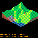
This is a first crack at a terrain manipulation demo in that style. There's no game here yet, just a small map you can terraform and a little dude running around willy nilly on it and seeming rather distressed when he's in the water. I may try and build a little game out of it, though just sort of working out how to handle the isometric sprites in a basic way has been the rewarding bit I was aiming for.
A neat discovery in all this was that I could get all of the terrain drawn using 7 distinct sprite shapes, thanks to careful use of horizontal and vertical flipping and palette swaps (and if I wanted to trade a little more code I could get rid of one of those by compositing two others). Was a little bit of a note-taking headache to make that work, but really satisfying once I got it.
Right now the map is just fixed in size (I threw in a little camera movement to follow the cursor around), but an obvious next step tech-wise would be to dynamically scroll through a larger map only showing a chunk of it in the viewport.
Hat tip to YellowAfterlife for their slick isometric demo last week, which put me on to the idea of giving this a shot.

This is real slick, and surprisingly easy on the eyes! Would love to see a playable version (and now I'm inspired to recreate Utopia from Intellivision).

Can't wait to see future endeavors in the isometric sector! (some form of XCOM, mayhap?)

I was thinking of that Piranhas game I used to play on Miniclip.com.

Are the graphics ripped from the DOS port? Looks really nice.
No, just estimated roughly from screenshots. None of the existing versions would work directly even if I wanted to lift the art, since it needed to be scaled way down to fit a reasonable number of tiles on PICO 8's tiny screen. Each of my tile sprites fits in a 2*2 region of the sprite map, including a lot of wasted space due to the diagonal nature of a given tile -- a lot of wasted negative space there (though it could probably be reclaimed if necessary through some really aggressive sprite coloring hijinks and pal() and palt() calls to ignore non-target-tile content of a much more tightly packed sprite sheet).
My method was basically:
- Look at some screenshots.
- Try to estimate the major tile deformations the game used.
- Sketch those out.
- Come up with a relative coordinate system for classifying each allowable tile deformation.
- Figure out horizontal/vertical/rotational symmetry for different deformations that could use the same sprite, note those down.
- Build a lookup table for all of that.
The art itself turned out to be a pretty minor part of the process, and I'd like to look at going back for a second pass on it at some point to see if I can make it feel a little more organic and less straight up dithered, but with such small sprites there may not be a ton of room for expression there.
If anybody feels like having a whack at the art or at building something, you're totally welcome to dig in.
[Please log in to post a comment]


