SOOOOOO...
I got sick of making overly easy games to practice and get better
so i decided to start making small visual demos instead.
i have found that it is much more effective for me!
and ive gotten a LOT better in the past couple weeks in my opinion.
so here are my 2 main ones. enjoy!
tell me what u think!

1st, making things is a great way to learn, so no matter how negative I’ll be, it should always be considered a win.
About light trail:
Scrolling stars look nice. The comet trail could be much better, even with two blues, and circles , you could have used fill patterns for a more progressive trail decay.
The circle centres of both the comet and its trail bullets are always drawn when their circle centres are in the screen. This creates a teleport snap effect, the comet and its tail never really enters or leaves the screen area.
There are many different ways to fix that :
Wraparound effect : if a circle cuts a border, draw it again 128 pixels away so the cut part of the circle is visible on the other side of the screen. A circle covering the screen corner is drawn 4 times.
Other option : offscreen snap teleport. Basically the same as the current logic, but the logical screen is extended by the comet diameter so every circle is drawn only once and you get to see the comet enter and leave the screen.
Comet movement :
It’s weird : even though movement is frictionless , there seem to be a cap for the horizontal component of the speed, and another indépendant one for the vertical one. That means that diagonal max speed is 40% more diagonally than orthogonally. And if you try to change your direction from upright to downright, you’ll achieve it as fast wether you press down or downright. Lots of different ways to improve that, feel free to ask if you want help.
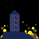
About fire and water :
Rain is ok but lacks wind for a stormy night.
Fire particles are ok on their own, but clash with the more realistic style of the rain.
The lightning effect is super effective, and works great with the rain, but all three effects work against the tower graphics : because you can see the lightning and the fire through the windows, the tower feels like a flat cardboard cutout , when it would have been perfectly fine and believable on its own. What could have been done is palette switching during the lightning since you have unused palette entries: some black stays black, tower highlights on one side of the tower are affected to black, but switch to light grey during lightning to simulate a lightning from that side, another black for lighting from the other side, and a last one for the front.
For a front lighning, switch the three, and for a lighning from behind the tower, just light the two sides in dak grey. For the windows, having them switch between black and yellow is enough to make them believable and to make the tower inhabited. A few orange and yellow flicker is enough to evoke a fire, especially if you add a chimney with smoke that can also help reinforce the feeling of the wind.
[Please log in to post a comment]


