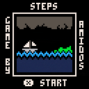
this is a mod of the Minit demake Steps
check it out here:

While the charm of the game was to be B&W and minimal, @Sup3rAw3som3Gam3r. I do like the color selections you have made.
Nicely done. Gold star.

@Sup3rAw3som3Gam3r ,
Hello, I'm porting steps by @amidos2006 to early IBM PC (CGA).
The game will use text mode to simulate 50 lines and 80 colums of pixels.
Each big pixel can be set independently of the rest to any of the 16 colors of the CGA palette.
I'm pretty bad at pixel art and wanted to know if you were willing to help with the coloring.
Here's my WIP :
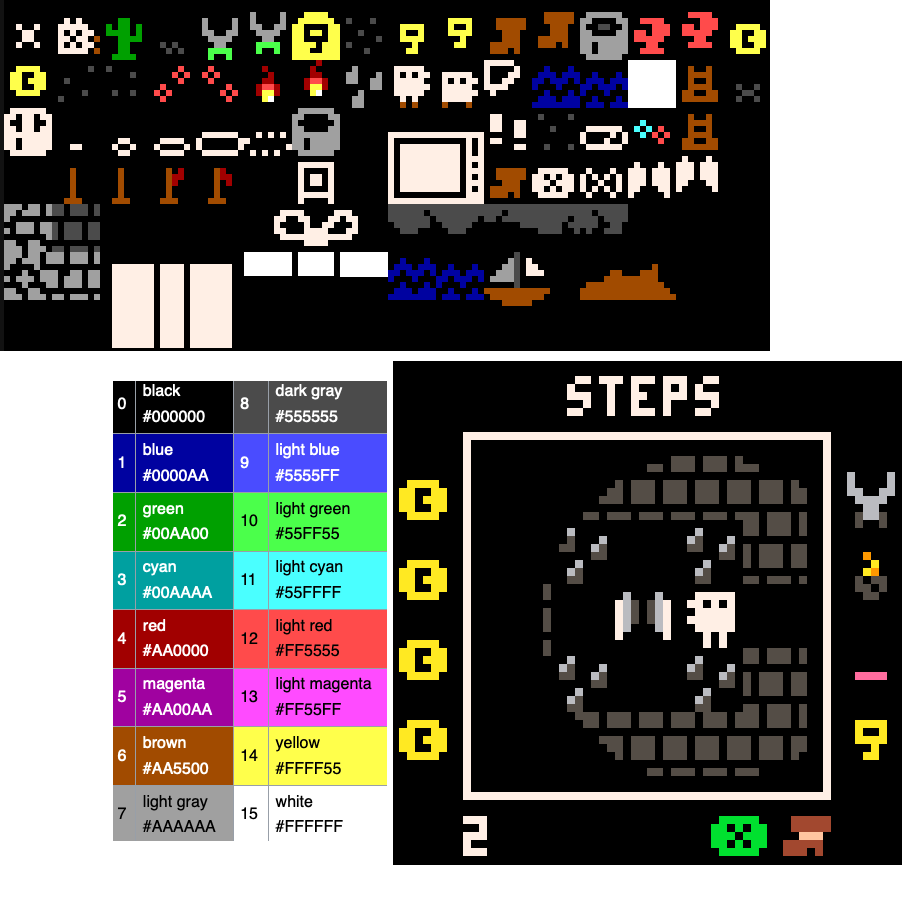
BTW, I see you changed the glove item to a line item. What was the reason ?
I'm also working on an aquarius computer version. The aquarius has a different 16 colors palette, similar resolution than text CGA (48 lines and 80 columns or 50 lines and 78 columns for technical cutting cost reasons) and an extra constraint that each 2x2 pixels can use at most two colors.
If you're curious, the online drawing tool is here :
https://aquarius.mattpilz.com/draw/

I think the main coloring of this mod, was based on the interpretation of the person as they thought the torch item (or flame) is a bomb.
I love the spritesheet colors you proposed, look pretty great, since you have colors I would add a small detail the player only has brown shoes when you get the shoes :) it will look amazing.
Let me know if you want some help with coloring :)

For the aquarius and PC, the X button icon doesn't make sense, it's a pico-8 thing, I don't know what to replace it with.
For the shoes, the nice beige band doesn't work with the CGA palette, light red doesn't look good. What I can do is change the shoes colors : brown when inactive, and light red when active, both on the hud and on the player's feet.
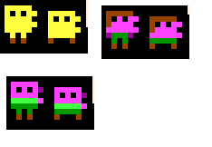
I don't know how to color the player : are the two side pixels arms or a mouth ?
I'm also unsure about spikes and wings. I could mimic the greyscale of the colored version, but the CGA dark grey is too dark, and the white is way too light. It doesn't look as good as with the pico-8 palette, and monochrome might actually look better than a failed attempt at gradient.
EDIT forget to at @amidos2006

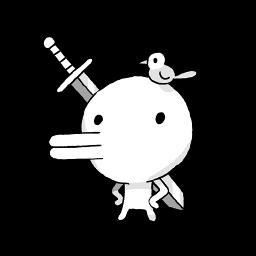
This game is inspired by Minit so it was supposed to be a mouth like in Minit
But of course, we can deviate from that. About these colors to the player, it make them feel like a zombie or chicken so not sure if I like these, minimum usage of colors with maybe colors for items and small stuff might be more interesting :)
If you want me to take a stab at it, I can try but maybe you could ask someone who is into limited palettes like (https://x.com/c64cosmin)
[Please log in to post a comment]



 rahhhhh
