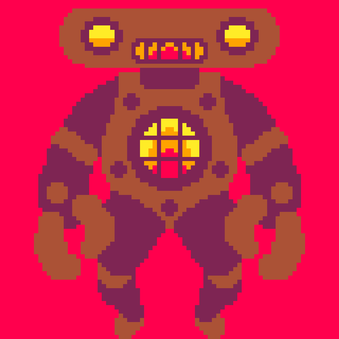
All my tweetcarts in one cart, accessible from a unified menu. Will update as I create more.
Menu Controls:
- Up and down to navigate menu
- X/Z to hide the menu
- To show the menu do any of the following:
- Press Tab
- Enter and select Reset Cart
- Ctrl-R for quick reset.
What is a Tweetcart?
Tweetcarts are Pico-8 programs written in 280 chars or less (the size of a tweet!).
For example, Eclipse is just this code snippet:
circfill(63,63,10,0)pal({129,1,130,2,136,8},1)::_::circ(63,63,10,7)x,y=rnd(128),rnd(128)a=atan2(x-63,y-63)c=pget(x,y)if c!=0then
c=rnd()>.9and c-1or c
pset(x+cos(a),y+sin(a),c)end
goto _ |
Since their so small (even by Pico-8 standards) it's possible to fit them all in a single cart!
Special Thanks
- Michał Rostocki for their amazing tweets and a bevy of techniques.
- Marta Fijak for their lovely tweetcart tutorial series and tweetcarts.
- Zep for creating this wondrous artform.
Updates
- 0.0.5 Made screen flips work with menu. Fixed issue with Rorsach. Fixed Burning goto _. Added more carts.
- 0.0.4 Fixed bug with menu dset
- 0.0.3 Ability see the carts while still on the menu. Added even more carts.
- 0.0.2 Added a couple of carts, made menu prettier.
- 0.0.1 Initial Version with most existing carts.

These are pretty cool, though I must admit that I had to turn them into something more readable before I was able to understand what was going on :)
Great work!

haha, yeah readability is pretty antithetical to tweetcarts. thanks!

How did you get the idea for the carts? I mean, let's see if I can make a tentacle horror tweetcard isn't normally somethings that comes into my mind.
Which is a bit sad, TBH, because it's awesome. But that's another story :)

most of the time I start with a subject or a technique think could be cool, work on it for a bit and let morph into something else in the process. then let it sit for a day or two before condensing the code and adding features if there's still room.
cosmic horror started with "put a bunch of circles in the row and give it a sin wave, maybe it'll look squid". they were going to go outward, but the way it was coded did the inverse. thought that actually worked better, but didn't like them all merging in the middle so made a gap in the middle.
then played around with methods of clearing the screen, choose a phasing look. still had a gap and chars left so used a blue circ as the earth and a pixel moon to really sell it being a giant eldritch being.

neat - good idea (and a good source of inspiration for transition screens or background art!)

yep! was also thinking about tweetjam potential of a collaborative cart version. quick to copy and pastes new ones as each is in it's own function, to avoid goto _ overlapping.
[Please log in to post a comment]


