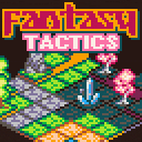
I am working on a project for URL LOWREZJAM 2020 and I think it is time to present it here to get some comments maybe.
The cart is quite far from being playable but as there's been some expectation around it I've dediced to keep the wip cart here so ppl can comment and try it. Don't expect too much out of it, still very early
CART UPDATED
Updated with a bugfix... using potions broke unit release
It's going to be a "tactics" like game (tactics ogre, final fantasy tactics...). Still plenty of work to do and not sure if I will be able to put everything up for the Jam but for sure I am gonna keep working on this to a point it becomes a playable game. For now working on 2 carts... the game itself and the editor and probably I will release the editor/isometric renderer on it's own cart in case someone wants to experiment with it once it's kind of "complete"
Project is in MODE 3 as the jam is 64x64 and I am using some odd sizes around (my general sprite/object box is 10x16) even though I am adding full support to custom sprite sizes for the renderer itself.
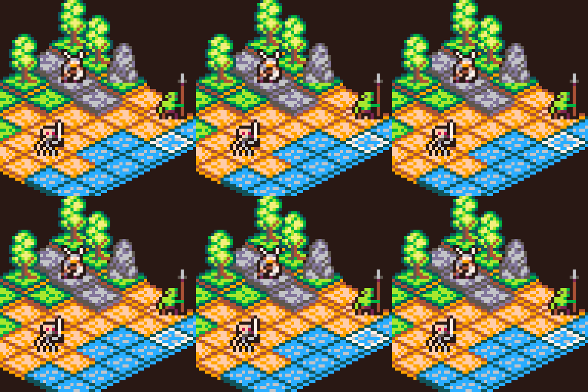

At the current version it moves 20x20 tiles at 85-90% cpu at 60FPS but I think I can bring that down a bit... There's a few optimizations like truncate tile rendering when outside the clipping boundaries (some hidden blitting is already in place but need to push that a bit further)
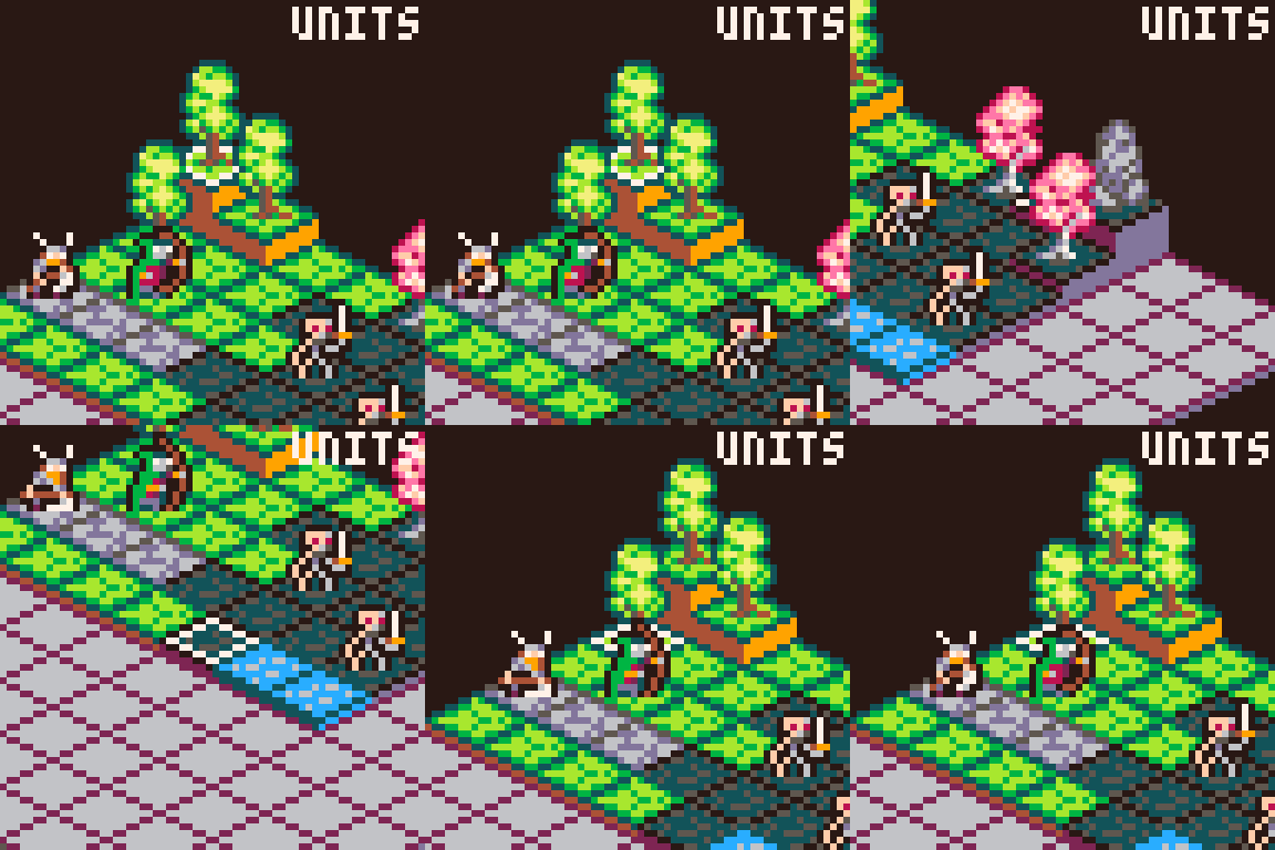
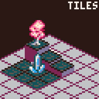
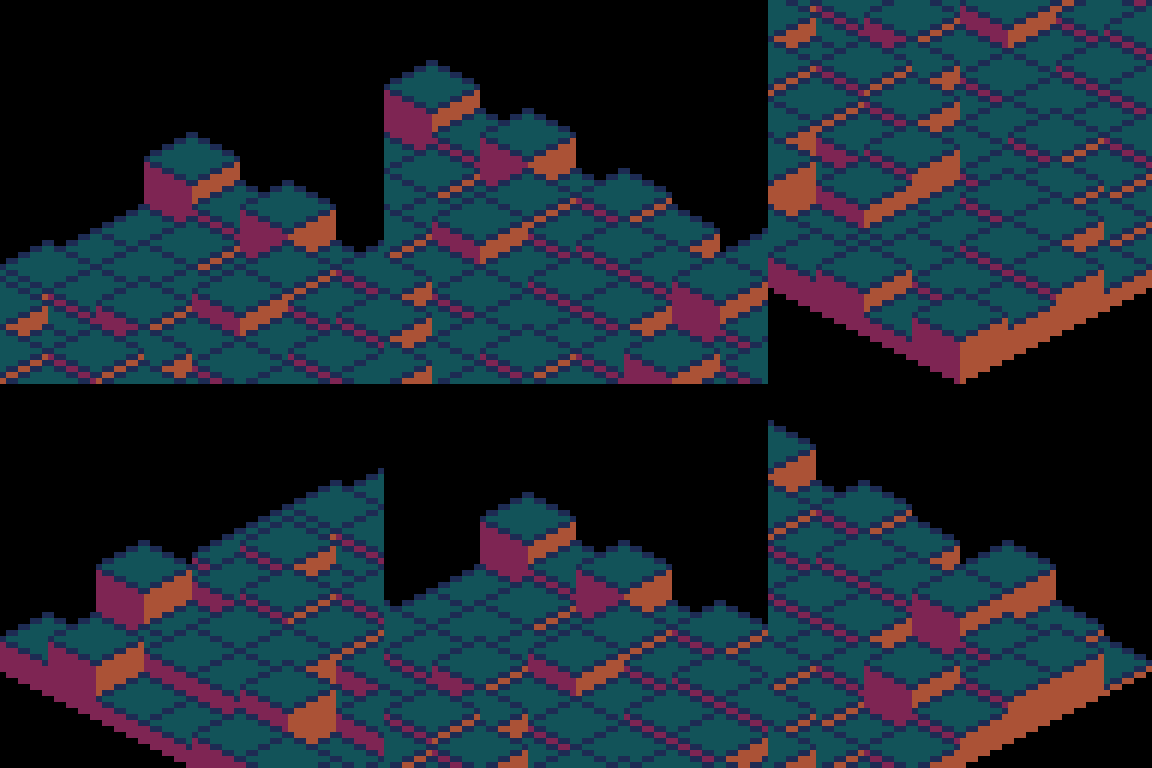
Some images on how it has evolved to the current state:
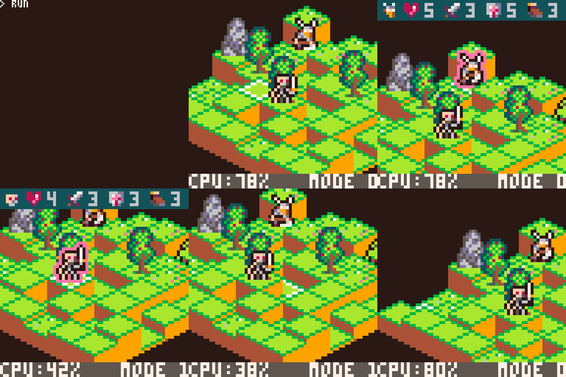

Hope you like the idea, comments appreciated.

Thnx @spellcaster, the data structure is a collection of "tiles" (an NxM array) each having it's own height. This limits what you can do with the engine (f.e. "floating" tiles at different heights). As this was a quick engine for a jam I really went on solving what I needed for the purpose, not for a generic filmation like renderer

yes - the game looks very promising!
(I wouldn’t mind a HD version in full 128x128 glory!)

It looks like this @freds72 but performance suffers :)
With properly designed levels it for sure will be able to do it (that's a 20x20 map)
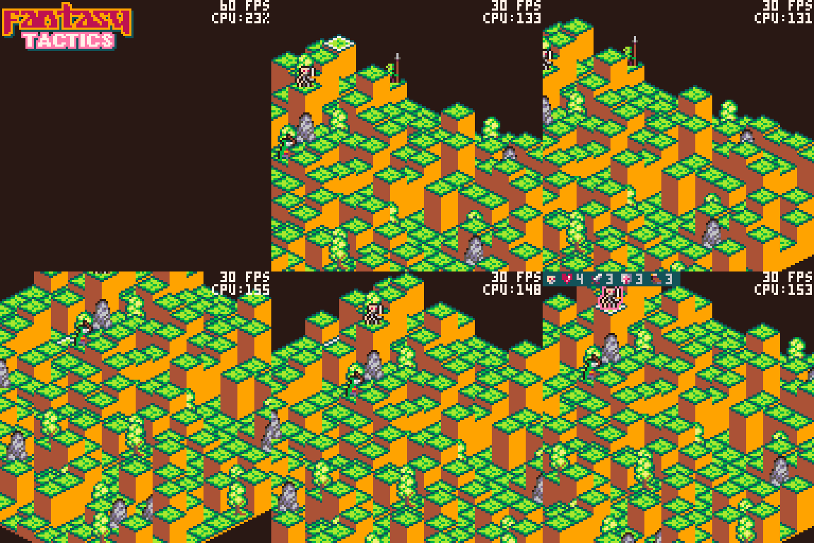

Update for the day... so I have decided to change a bit on the setting... this will be the Kingdong against the Undead (simplifies unit design :P). Also I have improved rendering so at 64x64 you get at most 50% cpu for any map size (tried up to 100x100 with fully random heights and got up to 48%) as now map size is not relevant to the number of tiles rendered (screen and tile size is though...)
With this exact tileset and full screen view area 128x128 gets to around 60-65% cpu on the sides but with heavy height manipulation at the center of the map 150-200% cpu... need to try it with double size tiles as that would drop dramatically the number of iterations to blit the map.
Leaving you some more gfx updates
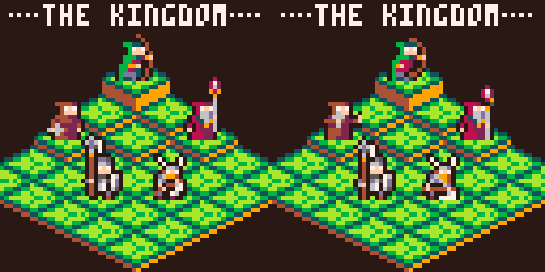
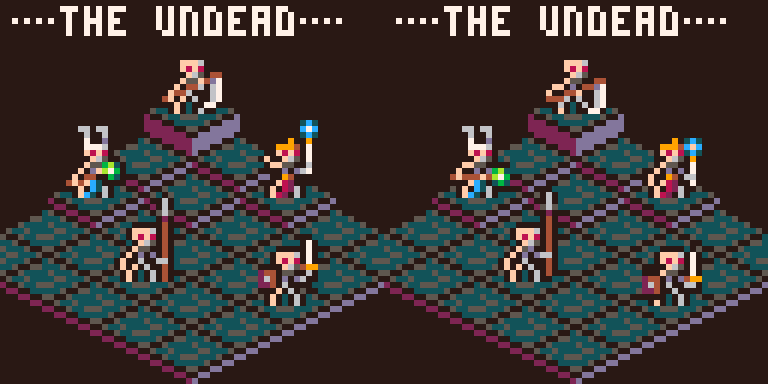

Looking at all these gifs I have to say: Your grass tiles are awesome.
From a design standpoint, why did you choose the "rotated" way of rendering (increasing map-x will increase x and y) instead of using the offset method (increasing map-x will only increase x, increasing y will alternate a y-offset)?
If you use a visual map editor, both version should work equally well, so I think you might have a design reason for this.
I used the angled approach mainly because it made setting up my map data init more easy.

Thnx for liking the tiles @spellcaster... I am not so sure about the "dark forest" grass tile... contrast is a bit meh and it has some issues with unit dark outline but I don't want to put that much time on fixing it now as I want to have something playable in time. BTW the tiles look great on full 128x128 but they are a bit too small in size to create a set that is seamless but keeps the grid definition. I might work on that at some point with some slightly larger tiles and bigger sprites. Number of tiles reduction would also allow full speed for the engine at 128x128 as now it is a solid 130% on flat maps with the full screen tiled and around 200% with heights and units
About the design decision I guess it's a personal taste... it's like configuring page scroll having down sending the text up or sending it down... for me it makes more sense like this and alinges to what I mentally expect when pressing left/right or up/down.
I am still adding things to the rendering, like empty tiles to support non square maps but I am close to start getting some work on the gameplay... let's hope I can do what I have in mind today as for sure I am somewhat behind in terms of completion for the gamejam.


solid basis - tile move feedback is clear
not too sure about the menu right in the middle of the screen.
do you risk hidden the target?

Thnx for the feedback @freds72. Feeling you guys really keeping your eyes on this prototype ;)
The menu goes out once you select your action... so when you pick "move" menu goes out and you'll get a highlighted area of movement, same for attack or spells, inventory will change to inventory view (to use potions and such). Still trying how to sort things for UI... 64x64 is a killer and calculating a position for the menu would incurr probabbly in many position adjustments I guess. I was thinking maybe on a "+" format but that will be even bigger

I really like your work... just looking at it always gives me some ideas.
Could you use the menu (just from a lowrezjam point of view)?

Thnx for your comments @spellcaster on this buggy prototype (fixing the -1 tile move thing... wondering how nobody noticed, including me... it's what you get when you move a -1 to some other place and don't propagate the impact)
I have not thought about that option with the menu... as long it "fits" the resolution I guess it could do... anyway I am throwing away my original intent on UI... will go Fire Emblem style... you activate the unit and get the move and attack range... new activation you get action and attack options... cancel button to reset unit state if no action has been taken... fire emblem uses a centered text box with the action list for that and I think that can have a consistent UI mode for this resolution
The good thing is the move areas are faster than I expected to calculate and render (I initialize them and attach the data to every unit... they get recomputed after that unit has moved so they are ready for next use) so move does not need a particular costly action and can be the default action and goes away from the menu

OK... advancing bit by bit... Movement is reasonably consistent... fixed a pathfinding bug allowing you to jump to far over water... implemented unit move in the movearea boundaries, position reset, action menu display (not really that functional...)

In the TODO list...
- unit actions (by the way I forgot to add items... I think those will be dropped for this prototype)
- spells and skills (risk of not having those... if I drop a thing it will be this)
- attack zone calculation and display (the A* should help in that)
- actual combat (basic crude combat rolls...)
- adjust unit stats accordingly to the actual combat system
- implement turn logic (identify side, control 1 action per unit, auto-end, manual end...)
- implement enemy AI
- victory conditions (kill all units in the other side)
In the wishlist...
- sound
- items
- facings
- attack animations
- falling damage
- savestates (so you can resume mid-battle)
In the full feature set
- campaign mode (different scenarios)
- more than just kingdom and undead factions
- scripted inter-missions based on the engine
- move to 128x128... if performance holds...
- smooth tile scrolling
- almost for sure this ends up multi-cart
- a lot more tiles (different settings, insie, outside...)
- scenery big elements (buildings, walls...)

Cool to see updates on this!
It’s nice to have words in the menu to know what the options are. The icons were really nice though, maybe there’s room to add them too?
Good luck with the TODO list for the jam!

Thnx @merwork ... For the jam it's gonna stay like this, no time and as you can see no space :P
I am pushing on getting the game mechanics in place so it can be played to an extent, the biggest lack will be sound... not even started looking into that and it's not my particular best... I can play some instruments decently but this "tracker" thing beats me XD
right now pushing on basic combat to have it in place... silly basic mechanics... att value -> number of "dice" you roll to attack, def value -> number of "dice" you roll to defend... dice distribution 3xsword+2xshield+1xmiss, sword in attack +1 dmg, shield in defense -1 dmg... no counterattacking. Units still don't notice they have died :P and I need to readjust all attribute values through the whole set of units (globally rise lifepoints for a start and make movement speed, att value and defense value balanced)
I have a very rough base system to support spells and other actions (healing for the priest, fireball for the mage, potions ... ), so probably those will make it into the jam entry.
Still need to think on the AI and it would be nice to sort out an issue i have when calculating targetting areas, now blocks (units, trees, etc) don't prevent attack propagation. That is intentional for some units (like the archer or magick users) but not for the rest... tried to fix it but got overcomplicated so for now it's an accepted bug.
Code is getting more and more messy, getting close to 6000 tokens (a bit over but there's a known bunch of tokens I can take off (somewhere around 500) as I started implemeting a full z/priority managed entity list I am not using due to ISO being drawn in "painter's algorythm" approach.
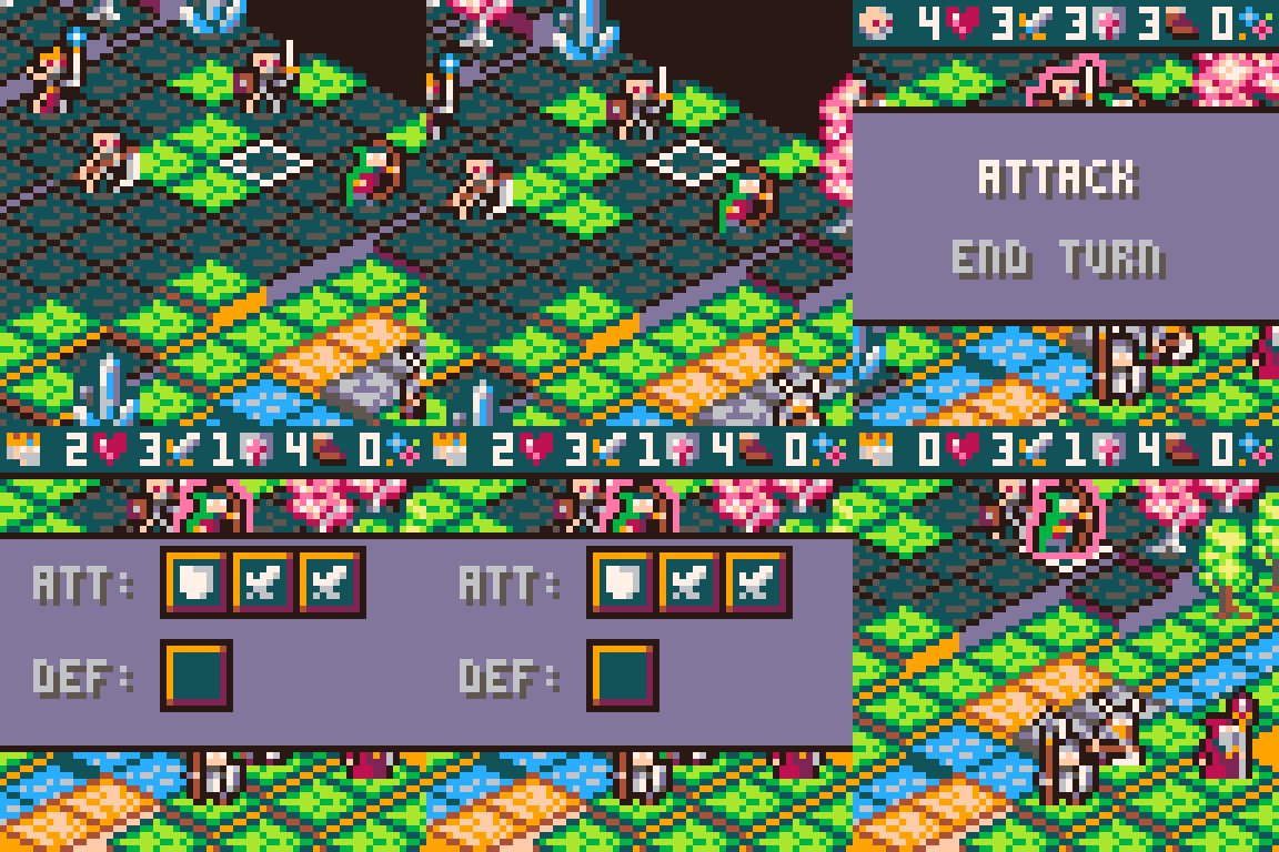

So that's it... too much time invested on this in too few days... needing a rest and massive code revisit... it's starting to be hard to handle new things without refactoring heavily on the base... This has ben submitted to the lowrezjam, I will retake on the project... probably on a new thread and probably on 128x128 so most of the big issues with resolution and UI can be solved.
Hope you like this little experiment

Just found this while researching what types of tactical RPGs other people have built-- I'm really impressed you fit this isometric vibe into 64x64 pixels, and I like all the custom statusbar icons as well.
The 128x128 screenshot of a tech demo (I don't remember if I saw that here or on Itch) was also impressive-- did you end up taking that any farther, or did you move on to another project? I'm assuming the latter since I see you've released some other games since then.
Anyway, nice!

Hey @icegoat, thnx for the comments. I have a semi-working (stopped at combat and ai implementation) version for 128x128... I need to refactor the full thing as I came to a point I wanted more performance for full 60 FPS support and just the map and units rendering was peaking around 80-85% on busy full screen map views. I had a few prototype runs on a layered quarter-tile approach, but the complexity was skyrocketing so I parked the thing out.
Last experiments I moved to 30fps and added texturing to vertical sides... but that was still on the "old" code...

I have been quite busy lately and need to get back to pico8, see if my life slows down a bit and let's me catch-up.

I'm obsessed with the 128x128 version above ^-^ looks very unique. The highlights for move and attack are really nice too. Amazing work and a truly beautiful game!

Thnx @Huwans I really need to get back to this project and revamp many things. Core code is from a jam and i have evolved my Lua style a lot since the time I wrote it

Hey @maleficmax, it's been a while since I've been on pico8 projects... Had a disk crash and lost quite q few things (like latest versions of this project, most of dungeon manager and a few minor experiments) and my current job has been extremely demanding so my spare time diminished a lot. I still plan to put upa full version of the game, but I need to find some time and motivation to focus for a few months on it. Anyway it's great to see ppl keeping an eye on the project, and that helps building momentum to retaking it. Thnx for the interest.
[Please log in to post a comment]


