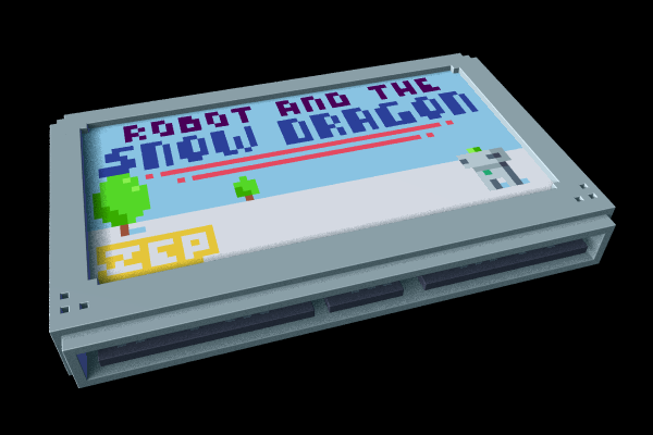
Here's an idea I'm playing with for 0.3..
One of the concepts I want to communicate is that the Voxatron Designer is for making whole games (or animations / shows / demos / playgrounds / music disks ), and not just Voxatron levels with a robot who goes around shooting monsters up. Also, I want to give people making carts the feeling that they've made something that has its own separate identity as a creation that can be shared. To do this, I'm playing with the idea of presenting Voxatron as a kind of virtual console (following more closely the pico-8 philosophy, which was supposed to be a mini 2d voxatron in the first place!).
This means that when you're browsing BBS levels, each one would be shown explicitly as a cartridge. The current BBS levels browser already kind of hints at this, but I think it could be interesting to go the whole hog:
Each cartridge has a 60x32 image that can optionally be drawn by the cart's designer, along with a choice of cartridge colour. I'd have to figure out a nice way of showing the titles on the top for easier browsing.
What do you think? Do you like the current minimal menus, or would you like to see Voxatron as a clunky pseudo-retro machine?

This is a really amazing concept, and a great way to browse user-created content. Would the pages then be "boxes" of cartridges, or how would you browse the massive amount of content?

Heh -- yes, exactly. For browsing through many cartridges the interface wouldn't be functionally very different from how it is now. The main thing I want to improve in either case is filtering by tags / favourites / author etc.

This in BBS = awsome + community rating could be the color !

Designing your own box art sound fun :)
Also, is the visible editor space and max room size are gonna get bigger at some point? :)

Nifty little idea there!
Perhaps we should choose our color, but blinddevil has a point when it comes to community rating, there should be an indicator of that too.

it'd be neat to modify carts alittle. Companies did that for the NES (Tengen). Maybe new cartride shaped could be a reward to those who post fan favorite games?

I recall D or someone had a good rating system that could be included on the edge. or a few stripes, blobs or icons to represent a genre and difficulty out of 5?

About Ladybug comment, that info could be written on the back of the cartridge (as we have some info on the back of game boxes)
I also find that color stripes of whatever on the top or side of the cartridge could be a good way to display users rating.

You should also be able to choose your cartridge's primary and secondary colors, the primary will be the cartridge itself, the secondary will be the trim and the rating stripes and the info on back, the details so to speak. The cartridge in my opinion should fit the theme of the picture in front of it.
Also, in the case of no picture, just put in the title in text format.

I have always been flummoxed as to why emulators and e-games services don't have this kind of interface - I'd be all for it.
Thing is, when you show stuff like this my mind continues that I should be able to pick favourite games/levels that I've marked/downloaded "off-the shelf".

Great idea with the carts, I'd love to see that.
you said that voxatron could be used to make whole, finished games.
do you mean that voxatron will eventually become an entire engine? allowing the creators to form not only voxatron levels but publish actual voxel-based games and publishing them outisde voxatron itself?
by the way, do you have any date for the upcoming 0.2.10? please take your time, I'm looking foward to it.

Carts it is then ( ^ _ ^)b
I took a quick break from 0.2.10 to try out a cart selection screen with placeholder labels. The labels are 60x32, which is large enough to fit a simple title (or abbreviated title) and picture, but small enough to fit in the interface.
The labels will probably replace the preview image that is saved on the viewable part of the png file and used as thumbnails on the bbs. This will hopefully keep file sizes even tinier, and create a more unified thumbnail style that look good as collections.
I still need to work on the cart shape, although it will probably remain quite simple and boxy. Designers choose a single colour from a selection of mostly bright colours. Using the colour to indicate something could be interesting, but I feel it's also a waste of letting the designer choose a colour that suits their label. :) Perhaps WIP carts could be dark grey though until they're promoted to the FINISHED section. Or featured carts could turn a reserved gold colour temporarily.
The carts are too small to write much on them (title etc.) but I'll first try out 'stickers' .. little icons stuck on top to indicate things like favourites, multiplayer, community ratings, difficulty & genre. Some very common properties such as difficulty rating might be better separately implemented as stripes etc though -- that's a nice idea.
In either case, the search filter will be able to handle ratings and difficulty too.
There will eventually some kind of playlist system, where you can tag carts on the web and then easily access them as a list from within the game. There is also a default 'collection' menu that shows the internal carts that come with the game (adventure, arcade) plus any bbs carts you've added to the collection.
Visible editor area: I extended the visible editor height and map height to 64 (from 48) for 0.2.10, but otherwise it's not something I want to get into yet -- editing at a higher resolution is too slow on older machines and would likely also change user expectations about optional in-game display resolutions!
Max room size: Yes. Now that the engine is mostly finished, I can get a good idea of performance and storage efficiency with larger rooms, and it's looking like 16 million voxels will be a good compromise. So for example, 512x512x64 or 2048x256x32 works too.
Needs more testing though. I'm also looking at a separate no-physics mode, where the map can be super-large but requires all of the props to be indestructible.
It's likey, yes :) But of course I want to get Voxatron out before supporting other stand-along Voxatron-based games. Something I'm considering though is to make all carts web-playable for free, so that designers can at least share their creations with a larger audience.
The web-player will improve as web tech browser support improves, but here's a working proof of concept in flash:
lexaloffle.com/voxatron.php?page=play&pid=7564
I don't have a reliable eta for 0.2.10 yet, sorry! There are around 90 hour-long tasks left on my todo, so if I had to guess -- two weeks plus a week for quality control. I'll keep you posted!
Just writing (clipped) titles would be a nice way to handle label-less carts. Maybe with a few generic background patterns chosen randomly. I'm quite keen to just draw a whole bunch of placeholder labels for classic bbs carts to get started too. Perhaps that's something other active users might like to collaborate on. The original authors would be able to override these by updating their carts with labels if they wish.

hey zep can you upload a level with a blank cart too the BBS so that we can start making our own carts? thanks

Here you go:
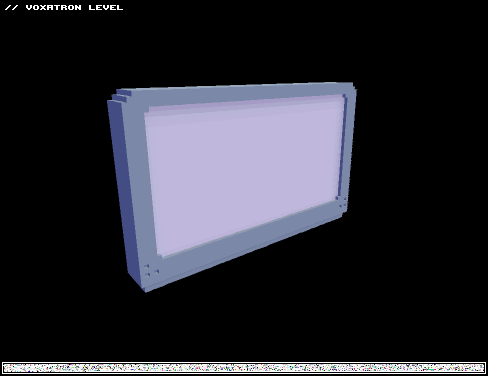
The labels are 60x32, and replace the white section. I haven't finalized the shape of the cart or the data format yet, but I'll write a little conversion tool to convert the label from this mockup format later on. So pixel away!

Hey, zep!
Are you planning this feature for v0.3?
(^-^)

Mr. zep:
is this feature gonna be for 0.3.*, or later on?

It will be available, just wait and calm down WhiteFireStone. This game is in alpha, and there's only "one" person who actually works on this awsome game. Developping games takes long and if he wants to implement this feature let him time. It will PROBABLY be there on the next update. But every game maker knows that the most important thing for their games is for them to be bugless (bugs are the most annoying thing ever ?).
So just be patient, anyway you don't upload often and you seem more present on the forum rather then in the game, so calm down, take it slow. It will be there soon :)

Yeah, they are pretty annoying... (The bugs!)
Now looking forward to the next update. Zep mentioned (before) that he was going to add a simple music maker, which I would really like. Looks awesome in the videos he posted, like almost everything in voxatron.
;D
[Please log in to post a comment]


