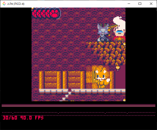
Yo @zep,
Instead of just turning the corner performance/stats graph on and off, maybe cycle through off, current size, and something closer to the full screen?
This could allow showing twice as much history on the graph, as well as showing a finer resolution of time within each tick. Right now we're only seeing 1-2 seconds (depending on _update/_update60) and the vertical resolution is very limited.
The large view might also accommodate more information that's not currently in the corner view. I'm not sure what information to choose—I'm just throwing the idea out there for you to think about.
Whatcha think?

how do you access this graph you're talking about? is it a new hotness?

The perf widget could use an extra line or two to show the min and max CPU and FPS.
Now, ear me out for another wild idea:
What if pico8 could emit a flamegraph showing, for each frame, which functions were called, stacked in call order, and how long they took.
Obviously that is too much information for a pico8 display. So the other option is to dump these performance snapshots to an external file that can be consumed by, say, the Chrome DevTool ;)
Would it really help and be worth the trouble of implementing this ?

I like that the screen is smaller and not covered.
Is this a far cry from pico8?


Ah, that's a good idea too! Cut the resolution by half (or a third) and use the empty border to show debug info. Nice!
PICO-8 only has so many pixels, of course, so it would have to work like sspr() and omit every other pixel to draw it at half size, but still, it'd work.
[Please log in to post a comment]


