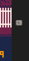
The layout of the clickable buttons (fullscreen, control help, mute, etc.) on the side in the 0.1.12c version of HTML exports appears to have broken in Google Chrome all of the sudden. All of the buttons now appear stacked on top of each other :\
screenshot:

The layout still works in Firefox. I guess Chrome recently changed their interpretation of CSS rules in a way that broke this?
3

Ah I think I found a fix

Edit the file in a text editor, find this part and change width to 1px.

Yep -- I did the same thing fix in my exported release of Heat Death (except I did it in JS because I was already doing weird things there).
[Please log in to post a comment]


