Revised 2020-01-17 to use and describe pal() commands instead of poke() commands.
One of the things that's been very much on my mind as I've been learning PICO-8 and making my first full game project in it has been how to use the console's limited palette, and particularly how to ensure that everything I put on screen is clear and straightforward to read. It is very easy when designing user interfaces to make something that looks fine in a screenshot viewed in a well-lit room on a bright monitor by someone who knows where and what everything is, but obscure or confusing in actual play under the varied conditions which your audience plays in.
Nothing substitutes for testing, but the number one idea that I've used to try to make sure I start with something easily-read or close to it is contrast ratios - essentially, how much difference in brightness there is between two colors.
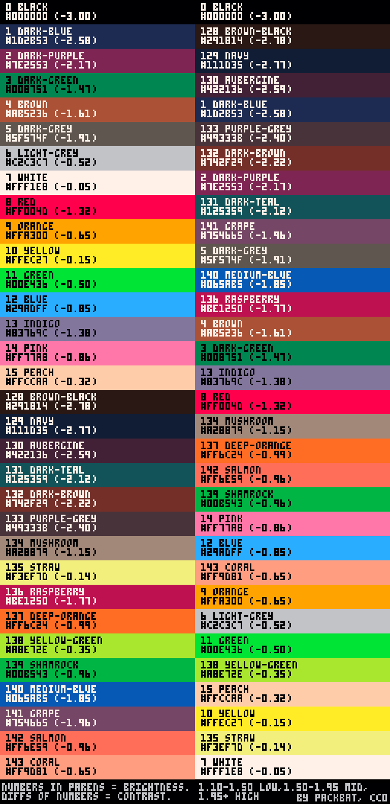
The hex codes and names for colors 0-15 I copied from the wiki page on Graphics - the names being from Roman Zolotarev's PICO-8 palette reference. The hex codes for colors 128-143 (the extended palette - see the draw state section of the wiki page on Memory) I measured myself with paint.net from screenshots, and I picked names for them using https://klaash.github.io/xkcdcolorpicker/ as guide/inspiration.
The brightness numbers and the guidelines for difference of brightness need a little bit of explaining.
WCAG2 and contrast ratios
The Web Contrast Accessibility Guidelines (WCAG) 2.0 have a section on the visual presentation of text and images of text. There are no guidelines as far as I am aware for purely graphical elements - how could there be? - but I use the three thresholds that WCAG2 describes as the basis for how I do this.
- For large-scale text, WCAG2 minimum contrast requires a contrast ratio of at least 3:1.
- For ordinary text, WCAG2 minimum contrast requires a contrast ratio of at least 4.5:1.
- For large-scale text, WCAG2 enhanced contrast requires a contrast ratio of at least 4.5:1.
- For ordinary text, WCAG2 enhanced contrast requires a contrast ratio of at least 7:1.
So: what is a contrast ratio? Click the link on the page, and it gives a formula in terms of relative luminance:
contrast ratio = (L1 + 0.05) / (L2 + 0.05) |
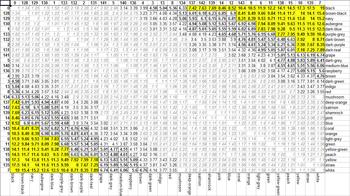
What is relative luminance? Click the link on the page, and it gives ... a collection of equations that are more complex than I want to get into, but trace all the way back to the 8-bit R, G, and B values used in sRGB color spaces, which I'm pretty sure is what most everything uses, including PICO-8. I plugged the formulae into a spreadsheet and managed to get out the contrast ratio data I wanted, which I then compared to these three thresholds from WCAG2 and used conditional formatting to display them all nicely.
...then I spent a long time thinking about how to make this easier to use as a general reference, because the difficulty of accessing information is probably what makes these things less commonly thought about.
What I've got right now probably isn't perfect. But I remembered a bit of math that might make things more straightforward: logarithms.
ln contrast ratio = ln (L1 + 0.05) - ln (L2 + 0.05) |
By recording brightness as a logarithm of the relative luminance term in the equation (kind of like how magnitudes of stars in the sky are recorded), I turn a ratio into a simple subtraction. For a pair of colors to have sufficient contrast, these log-L brightnesses merely need to differ by enough to meet the necessary contrast ratio:
- ln 3 = 1.10
- ln 4.5 = 1.50
- ln 7 = 1.95
...and thus I have a possible workflow: find your color in the list sorted by index, read out its brightness, add and/or subtract to calculate what brightnesses contrast at the level you need them to (a judgment call, but practice should help), and look at the list sorted by luminance to see what groups of colors at the ends of the lists hit that contrast level.
I hope this is useful to people, or at least a fun toy to explore the full list of PICO-8 colors with.
Edit: For convenience, I've also uploaded a text file with substantially the same information - probably more convenient to work with for many purposes, even if it's less colorful.

still stand by 140 being denim but other than that I like it

Thanks, y'all! (And I feel like denim is less saturated, but it's a fun proposal.)
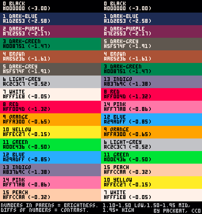
Also, while I'm here: the same data for just the default 16 colors, because I've discovered that's really handy to have.

I'm not sure if you saw, but the Graphics page on the wiki links to the Palette page, with (somewhat updated for orthogonality, consistency, and making ramps more obvious) names and hex values for all colors:
https://pico-8.fandom.com/wiki/Palette
FYI both Roman's names and the ones on the Palette page were arbitrarily chosen, so there's no law saying either is actually right, but I spent a fair bit of time researching colors when I added names for the extended colors and adjusted a couple of the base ones for orthogonality & consistency. So basically, with yours, we have three naming schemes now. :) Yay?

Funnily enough, I also spent a bit of time researching colors and I did it back in 2019! Put up your dukes, I'll fight you! :P :P
Honestly, though, while I think I get where you're coming from and I do like "lavender" for 13, I'm really not fond of "darkest-gray" for the very-clearly-brown color 128, "mauve" for the very-clearly-dark color 141, or naming 15, 143, and 142 as a peach spectrum. I don't edit the wiki because allowing scripts to run on Wikia pages makes my computer run like crap, but I did choose my color names carefully based on xkcd's color survey data - a very large data set based on how an admittedly-Internet-centric English-speaking group of people viewing colors on computer screens, exactly as PICO-8 colors are viewed - and based on the names that existed on reference pages at the time, and having the list of colors in order of brightness has been good enough to help me find ramps when I need them.
That said, I don't edit the pages and I'm not going to tell you what to do on the names. All I will say is that if you'd be down to add some form of brightness information to the Palette page, I think it'd be useful to people.

Oh, don't get me wrong, I don't think there's any more merit to the names I added to the wiki than the names you have here or the names that Roman used. I'm an engineer, by trade and by nature, and my artistic eye is kinda limited. You can probably see this in how I categorized & ranked colors, rather than just associating them with real-world examples.
So, while I do think I hit the nail a bit more on the head by changing indigo to lavender, otherwise I admittedly have so-so confidence in my set of names. That's why I added a disclaimer when I added the 16 new names, plus an invitation for others to adjust them if they were more savvy with color theory.
I hope you have more opportunities to edit the wiki in the future. I'm not sure what system you're running at your end, but for me, using Chrome or Firefox with Ublock Origin tames enough of the wiki/ad cruft that it's manageable even on this 8-year-old Frankenstein's-monster of a PC that I use. I'm happy to add your info to the wiki, but I'd really encourage you to do it yourself. I get a lot of satisfaction when I add knowledge, tips, and tricks to the wiki. You should too!
BTW, while I've made a ton of edits on the wiki, I don't feel any kind of ownership or anything. I'm just enthusiastic. I hope people feel free to edit anything they want to over there, including pages I've worked on. I see people add stuff all the time to things I've written, or reword things I wrote awkwardly, and I think it's really cool that we can do this sort of asynchronous documentation collab thing. :D

Please believe me when I say that I've tried relying on uBlock Origin alone and it's not enough for my ten-year-old piece-of-crap laptop. I did not decide to make it impossible for me to edit the wiki lightly.
I'm also, to be frankly honest, completely burnt out on editing wikis. You might not feel ownership, but I tend to, and it's exhausting watching people blithely edit what you put down and having to decide if you want to risk ending up in a massive edit war over something that you can't convince yourself is worth caring about as much as you care about it.
I'm not going to edit the wiki. I think the brightness information would be good to include in some form. When I tell you that I'm not going to do something, don't try to talk me out of that.
[Please log in to post a comment]


