My first Pico-8 game...
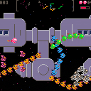
I wanted to make an old-fashioned arcade shooter, like Defender but not as difficult to play.
The end result differs quite a bit from Defender - except for its difficulty level. ;)
Tip 1: Completely wipe out a cluster of aliens and you'll earn an extra life. Survival means earning lives faster than you lose them (and you will lose them very fast).
Tip 2: If you already have three lives, an extra life will power up your smartbomb meter instead. When it's full - BOOM! Humanity's future depends on you triggering as many smartbombs as you can.
Tip 3: Those speedy pink loner aliens? Hunt them down! They're the last of their cluster, so that's where your extra lives/smartbombs come from.

Great game but BOY, I guess it shows just how bad I am at playing Defender. Super graphics and sound effects, just very hard for me to play and stay alive when the fish invert to killer mode. :)

I need to wait until I have access to a gamepad to play this one. It is VERY difficult! Your ship is very mobile, though, so I am hesitant to say that this is too hard.
This is an excellent looking game - great sprites, cool radar feature, and the camera work when you speed up and turn around is really great. Maybe it could use some music?
This is obviously a really polished game - I am going to dig in more as soon as I get the chance.

Woah, this is sweet! Yes, it's hard but that's part of the fun.
More so, it's a great implementation of the Defender mechanics, which is something that's been on my list for a while. Great mini map to boot.
Only nitpicky thing (which I might try to take a work on) is a smoother camera shift, rather than just switch sides. It a game where you switch sides so often, the cam jumping is vicious.

Thanks for all the comments. :)
I wrestled quite a bit with how suddenly the camera flips when you change direction. I hardly notice it now but in the early days I was close to abandoning the project because of it. I'd love to see how other Pico-8 Defender-clones handle the camera.
It's probably true that the game should have music, but I have a weird phobia about adding music to games. Anything other than gunfire and explosions just feels out-of-place to me.

Just played this on my PocketCHIP for a while and it's a blast there too. I'm slowly picking up on how the baddies react and in which order. High score is only 860 so far but that felt really good to reach.
Also...nice attract mode too. :)

My high score's 9540 if you want a number to chase. I'm usually pretty rubbish at shooters, but I guess I've got a head start with this one. ;)

Really freakin hard. Way harder than Defender. Like the style but not enough screen space to be enjoyable. Surprise!, we're on top of you. On screen, off screen, on screen, off screen. Ack. Took it to 390 and now I'm done with it. It has great potential but the rhythm needs to be work out -- if possible with the sprite size to screen size ratio.

Hmm, beginning to think the game's even tougher than I thought it was...
Is it obvious how the extra lives and smartbombs work? My main priority when playing is where my next smartbomb's coming from. I've added some tips at the top of the page to try to explain.
Thanks again to everyone for playing! The feedback is really valuable. :)

Smart bombs? That might change things...I guess it's not obvious to me. I just fly back and fourth trying to laser everything.

ditto - didn't notice the smart bomb thing. It sounds like they only help after reaching a certain skill level.
With Defender, I remember the sprites being much smaller versus the screen size. Thus, they are relatively further away and you have more time to react to them once on screen. Plus, you don't feel like you're looking at the world with blinders on like this game. Your sprites are beautiful and I'm sure you don't want to make them smaller. Thus, find a novice to play test it while you tweak speed and horizontal flipping behavior.
I remember Chopper Command feeling a bit like this so consider analyzing how they balanced it.

it's like defender with all settings to the max, killing any balance the original had.
- the worst offender is the forced scrolling, makes everything too fast. you should be able to control your thrust (and stop).
- the flipping is way too fast, the ship is almost teleported from one side to the other. actually that might have worked to some extent with original defender controls since you had to press the 'reverse' button, making the manoeuvre less frequent and more thought out. but here with 4 dir keys it should handle smoothly like a flying saucer. also I'm quite sure it's unplayable with a gamepad.
- the enemy seems too fast, but that might just be an effect of forced scrolling.
- they might be a bit too heavily shielded.
found a playable defender clone using 4directions control:
http://www.classicgamesarcade.com/game/21638/defender.html
- you control the thrust (no auto scrolling)
- the ship is placed on the screen according to its speed:
speedy right=>far left, stopped=>center, speedy left=>far right
another great remake was datastorm on amiga, on this one the ship stayed mostly centered on the screen. that could be a another option, though it doen't fit a square screen very well.
everything else is top notch and well polished though :)

> everything else is top notch and well polished though :)
:)
Okay, sounds like I've misjudged the playability of this pretty badly. Maybe one day I'll learn not to make games for which I'm the only playtester. ;)
Thanks for all the comments. Time to start a new project...
[Please log in to post a comment]


