Note: web player doesn't currently support 60 FPS rendering, so this is just going to look like a static palette unless you download it.
Hat tip to ilkke for the inspiration.
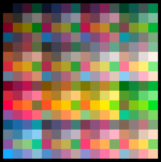
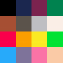
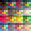
This is a simple palette vs. palette demo to show off the idea of color interlacing in a very simple way: it uses the new 60 FPS function to render very quickly alternating images of 1. a single large tile version of the pico 8 palette and then 2. a 4*4 matrix of palettes, one lined up perfectly with each of the large color squares.
The result, when viewed, is a flickery implication of 256 separate colors*, one for each combination of two colors from the pico 8 palette. As laid out in this example, that shows up as a series of variously tinted versions of the palette itself.
It'd be interesting to lay out the color combos in a more gradient-centric way, but this was far simpler to throw together as a first experiment.
Here's a rendered approximation of the interlaced effect as a smooth static image, though of course the visual effect in practice has a kind of restless volatility that this doesn't capture:

- "But wait!", you shout. "It's not actually 256 distinct color combos, because you have repeats of each color pair, e.g black-plus-white and white-plus-black! So it's actually more like, uh, uh, 128!" Fine, yes, you're very clever.

Great idea, I tested something like that, but using a dither pattern that alternate at 60fps between the two colors. It worked well but only for some colors, and it was still prety glitchy looking. Plus making a dither pattern can cost a lot of cpu.

it might be clearer if you had one image with 16 vertical stripes,the other with 16 horizontal stripes, you should get the original palette on the diagonal, and unique colors on either side of it.

Tried using a checkerboard pattern/dithering as NuSan suggested and the result feels a lot easier on the eye (at least to me), but has the drawback of looking extremely ugly if the game skips a frame or you pause it.
Edit: I believe the number of unique colors is 136 (120 combinations + 16 "pure" colors)

Flickering between complementary dithers has its ups and downs. I like doing that because it means if either image gets held for more than a frame, you still have approximately the correct image, but there are some issues:
1) PICO-8 doesn't do gamma-correct upscaling. This causes a screendoor effect if you flip back and forth between two dithered images.
2) When moving the eye, it can infer motion from the flipping dither pattern.
Personally I've settled on flipping between solid colors. The only problem is that PICO-8 drops a frame now and then for no apparent reason, which gets ugly in a hurry.

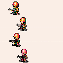
Quick test comparing solid colors vs dithering in motion using the infantry sprite from Advance Wars 2. Top two soldiers use solid colors, bottom two use dithering. Fast soldiers are moving at 1 pixel per second, slow ones are moving at 0.5.
Press and hold Z to make them stand in place.
Edit: Updated to use a different draw approach as suggested by Felice below. Press X to toggle between the default and new mode.

One thing you can do to avoid patterns is force all sprites to draw in exactly the same place twice before being moved again. That way the colors blend as expected and you don't get checkerboards accidentally reinforcing themselves when the movement is sync'ed with their repeats.
A simple way to do this would be to change your update like this:
function _update60()
  if (t % 2 == 0) then
    if not btn(4) then
      x -= 2
      xx -= 1
    end
    x %= 160
    xx %= 160
  end
  t += 1
end
|
That does cut your logic update rate to 30fps, though. You could run a lot of your logic at 60 (esp. movement and projectiles and such) while only updating player sprite positions on even frames, perhaps.
This is not a solid plan; I'm just pondering after trying it myself and seeing some improvement.

Good idea! I updated the cart in my previous post to use your suggestion.
My monitors are pretty low-end and already have ghosting issues to begin with, so only moving sprites every other frame makes anything moving at > 1 pixel/frame@30fps look a lot let sharp than the previous method. It probably looks a lot better on better monitors, though.
[Please log in to post a comment]


