


I spent some time analyzing the palette and came up with some things that I find make it easier to use.
I decided to share it here in case others find it useful as well, so here goes.
First ting I did was map the colourspace. This makes it very easy to find nearby colours when shading or tinting.
The colourspace wraps horizontally thru the spectrum as illustrated by the double width block.
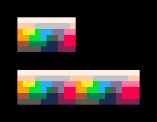
Next I reduced the colourspace to use single pixels instead of clusters. Less accurate but more compact.
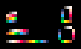
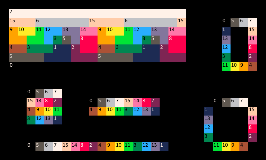
Based on this I came up with an comfortable order of the 16 colours (as I found the default colour order not very user friendly). Apart from making it easier to find the right colour quickly, I wanted to make sure it looks pleasing :)
You can use this order regardless of your gfx software fo choice. I made sure the palette works whether it's presented in a single row, 2x8 or 4x4.
An added bonus is that the this order also wraps around nicely, as illustrated by the 'ring' versions on the right.
Lastly I set myself a challenge to make 16 'materials', using each of the 16 colours as the base colour.
In essence this meant creating 16 colour ramps that all feel different. Of course, my personal artistic choices here might not mirror yours.
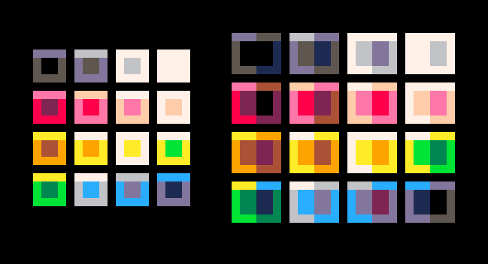
I found this to be a handy reference when looking for the perfect colour to shade with.
Hopefully someone else finds this helpful.
i


this is awesome. It could be awesomer if there were numbers on the swatches. Mind if i nick the picture and add numbers?
Sure you can, although to be honest I was planning on adding the numbers myself :)

Nice post!
You might find this thread interesting too -
@_discovery Ah yes, great thread!
Interestingly enough I ran the pico-8 palette thru dawnbringer's plugin myself way back in December 2014 :)
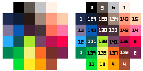
Here's the numbered reference
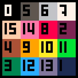
As this order wraps around you can use the array for all sorts of colour cycling effects
palsorted={0,5,6,7,15,14,8,2,4,9,10,11,3,12,13,1}
|
I'm finding this arrangement of the palette extremely useful, it's much easier to understand. Thank you! I combined your layouts into a single reference image and added numbers, I have this open whenever I'm drawing now.

I'm familiar with this color-wrapping and blending method to give the illusion of greater color control. You can see I did that here when doing the top players:
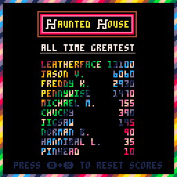
The code for these colors are:
hue={1,13,14,15,14,13,1,2,8,14,15,14,8,2,4,9,10,15,10,9,4,3,11,15,11,3,1,13,12,15,12,13}
|
And they wrap around neatly, total of 32 in all.
I especially like Ilkke's "wheel" reference here. It's something I haven't considered with the small amount of colors available:


I recently did a similar color study but on both the default and secret palettes together. I really liked the wheel arrangement from this thread, so I attempted to include the secret palette by arranging its colors within.
Default palette = Outer circle
Secret palette = Inner circle

[Please log in to post a comment]