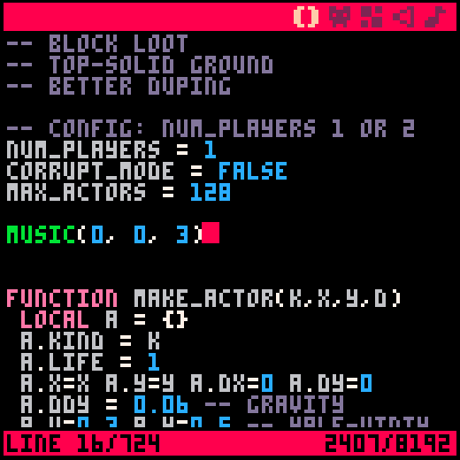
I mentioned this issue a while ago, but it seems zep didn't see it. The color of the cursor is too similar to the background color of the editor, and makes it very hard for colorblind people such as myself to see where it actually is.

I personally rather like the color scheme, but perhaps there should be an option to alter it (i.e. define a config with special color bindings for syntax) - or at least provide some swappable alternatives. It sucks that you have trouble seeing it right now!

I totally agree, when I first purchased pico-8 I didn't even think there was a cursor it's so difficult to see. So many tools rely on color to make it 'easier' for development, unfortunately some of those little things make it more difficult for those of us who are colorblind.
I would love to see the ability to change the cursr color, I'm really concerned that it will be impossible to see the cursor on the pocket chip.
Please give an option to change the cursor color, even if it's via a property file.
thanks!

What kind of colour blind is this? The cursor and the editor background look very different to me (not colour blind) but I absolutely support such a simple change to make things more accessible.
The cursor colour is the same as a band of colour across the icon bar at the top and the status bar (with line and RAM text) on the bottom. The text and unselected icons are all in a third colour - you can see those, right?
I know there are at least two kinds of colour blind which cause different colour pairs that are easily distinguishable to some of us to be indistinguisable to people with that colour blindness. Is the 16 colour palette failing in any other areas for you?
Rather than add endless options perhaps the cursor colour should be switched.

The bottom bar is easy to see because a) it's much larger than the cursor and b) its always located in the same spot. (also it's the character count, nothing to do with RAM)
The cursor is the only color related issue I've had.

strong protan. I have trouble with many shades of colors. purple looks like blue, some pinks look blue, greens and yellows can be a problem. so all over the chart. a config file to set different parts of the editor would be cool

Here's a super-quick mock of a high contrast mode:

Charles916, is this an improvement? Not shown is the cursor over a character, which might be its own issue...
I'm not in a position to make it happen, I'm just curious if it can be done within the P8 palette.

I can second this - I'm red/green blind as well and need to guess the cursors position, I can only see it slightly by movement. This should really be changed.

I have some half-baked plans for altering the editor colours, but in the meantime you can also:
pal(5,0,1) |
The palette gets reset after the program exits though. You can set the palette resetting mode to 'persistent', and put this code at the end of _draw() of the cart you're working on:
pal(5,0,1) poke(0x5f2e,1) |
.. but it means the colour will also be swapped during runtime.

dddaaannn, nice mock up
zep, thanks that workaround works
thanks
charles
[Please log in to post a comment]


