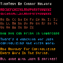
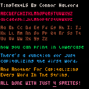
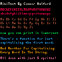
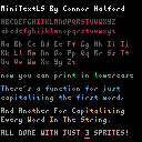
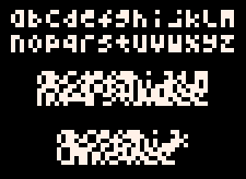
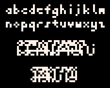
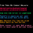
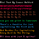
I've made a series of fonts for the PICO-8. Each font uses as few sprites and as little code as possible. An 'LS' version of a font uses Less Sprites at the expense of longer code.
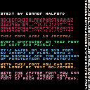
TinyText: a lowercase font meant for use alongside the uppercase system font. Each character is just 3x4 pixels and aligns to the bottom of the system font, meaning lines of text are still 5 pixels tall and 3-pixel monospaced. The whole font uses just 5 sprites. Can fit 21 lines of text on-screen (the same as the system font).
TinyTextLS: the same font as TinyText but with just 4 sprites!
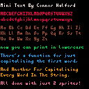
MiniText: a prettier lowercase font also meant for use alongside the uppercase system font. Character size varies and can hang below the writing line, meaning lines of text are now 7 pixels tall (but are still 3-pixel monospaced). The code is a bit longer, but the font still only uses 5 sprites. Can fit 16 lines of text on-screen.
MiniTextLS: the same font as MiniText but with just 3 sprites! [deprecated, see LRP's Mini]
LRP's Mini: the same font as MiniText but packed into just 2 sprites by LRP!! It also uses less code than MiniTextLS, so it's all-round better - use this one instead of MiniTextLS! Find it in the comments.
These fonts come with 3 text rendering functions, plus there's the system print, so we have:
- print(str [x y [col]]) the system print function, which "PRINTS IN ALL CAPS".
- printlower(str x y [col]) which "prints in all lowercase".
- printfirst(str x y [col]) which "Capitalizes just the first word".
- printevery(str x y [col]) which "Capitalizes Every Word".
3Text: this is a standalone font that replaces the system font for printing. Every character is just 3x3 pixels and the code is very short, but it uses 10 sprites and is the hardest one to read. Can fit 32 lines of text on-screen.
- print3(str x y [col])
[b]SPRITES USED: TOKENS USED: LINES ON-SCREEN:[/b] LRP's Mini 2 3Text 164 3Text 32 MiniTextLS 3 TinyText 245 TinyText 21 TinyTextLS 4 TinyTextLS 410 TinyTextLS 21 TinyText 5 MiniText 411 MiniText 16 MiniText 5 LRP's Mini 590 LRP's Mini 16 3Text 10 MiniTextLS 676 MiniTextLS 16 |

License:
Pictures:
How the 'LS' versions work:
Old versions:

This is awesome!! You didn't put the CC license on it though... Can we use it in our things or not?
Great job anyways!

Thanks. I'm releasing this under the zlib license, which is even more permissive than the CC BY-NC-SA license, so use away!

Pretty cool idea and nicely coded, but don't let a typograph see this :V
non-consistency in the n, k, or p-lines makes this pretty messy and hard to read. I'd suggest raising the height of letters like f or t by one, lowering the height of letters like r, n, v, u etc. by one, and maybe adding a descender height of 1 pixel for p, q, y, g etc. Further, why in the world would you make the small L and J look like that, 2 pixel width should be more than enough, if not one. I'd also cut the top right pixel of the e, but that's personal preference.

@Pizza thanks for the honest feedback. The inconsistency in TinyText was bugging me too but my goal was to keep every character 3x4 and have the bottom edge line up with the normal system font. I still think that's worthwhile but I thought I'd make a prettier font too, let me know if you think MiniText could be improved! I'm new to pixel art and fonts but thoroughly enjoying both, constructive feedback is great for improving :)
@UrbanMonk, thank you!

These are great. For a font that is designed to fit into the least space, I think the uneven ascenders and descenders on TinyText qualify as charming.
I notice that the lowercase e in your MiniText image doesn't match the cart. There is a single pixel above the loop in the image, but no pixel above the loop in the cart.
I wonder if you could save a full sprite in MiniText by using flip_x and flip_y to reuse the same graphics for b/d, p/q, m/w, u/n/e, s/z. In fact, you could also omit "a" by drawing the bottom 3x3 from "d", same for h/n.

Dunno if the MiniText font image was already there last time I looked and I just missed it, but it's looking much, much better than the other one. If you wanna have the bottom edge lined up with the normal system font I'd just move the characters with a descender up one pixel, the ones with ascender down, cut the rest and call it a font. Basically having one font that's a middle ground between the two is what I'd suggest.

@LRP good spot. I was debating that pixel on and off for a while, must have grabbed a pic from earlier. Thanks for suggesting the flip stuff, making the LS versions was pretty fun!
@Pizza MiniText wasn't there at first, it was just TinyText. I've since added the LS versions and 3Text as well. I'm not sure what you mean about making a middle ground, I don't see how it would still line up with the bottom edge of the system font?

I just finished my own attempt at MiniText2, which manages to squeeze all of the characters into just 2 sprites! I had to make one change, to the "y", but otherwise the characters are the same.
Edit: Updated cart. The "y" is fixed and you can now switch between sample text and a sprite guide with z/x.
Edit 2: Minor adjustments in the sprite layout to reduce the number of flips required.


Wow, 2 sprites is pretty crazy. I thought about trying to change the order of the characters to overlap them more efficiently, but I didn't think 2 sprites would be possible!
Your InitChar function is obviously much nicer than the way I was doing it, but the reason I was doing it that way was so that characters which don't have (e.g.) a DX value literally don't have one, instead of storing a 0. I was trying to limit memory usage, but I don't know if it actually made a difference and it might have made the code longer than necessary.

The 3x3 is actually surprisingly readable! Very nice. Me like.

I'm actually passing nil for default values (w=3, h=3, dy=0*, fx=false, fy=false), which I think means that those variables aren't set at all. I don't know a lot about lua memory management, though, so I might be wrong about that.
I thought about encoding the character parameters in a bitfield (a single integer per character) or something similar to save some tokens, but I decided it wasn't worth it for this demo.
- dy moves characters up from the third pixel, so 3x3 sprites have dy=0, letters with full ascenders have dy=2, etc.

After some more manipulation, I managed to find a spot for the original lowercase y, so all of the MiniText2 characters should now match your original MiniText font. I updated the cart in my earlier post with this adjustment.

Big fan of the 3Text, now make a lowercase version of that in 3x3 :V
[Please log in to post a comment]


