Hello fellow pico-8-ers!
I was tinkering with this wonderful thing, it's magical.
My only minor curiosity so far is the palette color choices - not so much the limitations (I LOVE that part of the entire point so very much) but the specific color values that were chosen.
I'd be curious to hear:
- info and opinions on the existing palette
- your user experience dealing with the provided palette in practice, like the low/mid/high and shades you can make with it for example.
- and for the devs: if it will remain fixed, or if the color values may potentially be modified in future, perhaps hardcoded into the file somehow so it's still fixed, just configurable. I understand if that's beyond the goals.
Palette exploring
In my travels and exploration of various well known palettes I found that one I quite like to be a relatively close fit for the pico-8 colors, barring one index, and some value/saturation. This one from DawnBringer I quite liked, especially the presentation of it's applicability in use cases.
So, I ported the DawnBringer presentation/image to the pico-8 palette, out of curiousity, modifying the color indices to match the pico-8 values and see how it translated.
Here is the original for reference, if you don't know of it:
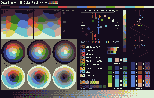
From this thread:
http://www.pixeljoint.com/forum/forum_posts.asp?TID=12795
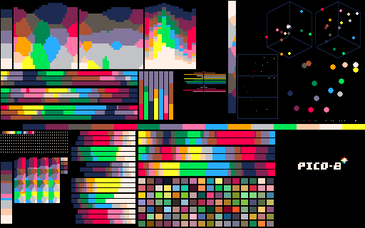
After originally editing the color palette directly, where the image would show the incorrect graphs, I was informed on twitter and in the comments the analysis tool that DawnBringer used was scripted for grafx2 and is available.
I reworked the image now, it uses the pico-8 analysis from DawnBringer's tools directly. So now all values displayed align with the pico-8 palette properly, and the graphs should be more useful. Thanks to baboum for posting a version in the comments as well, from the tools.
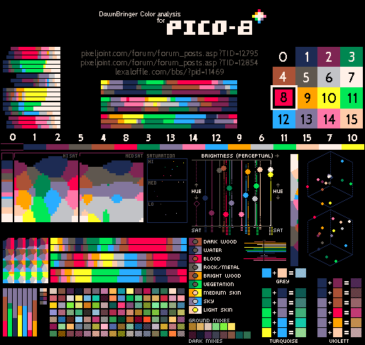
I'd love to hear your feedback on thoughts, as I'm no pixel palette master and would appreciate any and all input.
The cartridge!
Finally, I took that palette reference and created a cartridge with the sprites and reference nodes encoded in the spritesheet and map, and wrote up a simple display in a single screen for users to tinker with too. I'd pick a better name if needed, it's just a quick work up!
Here's what it looks like:
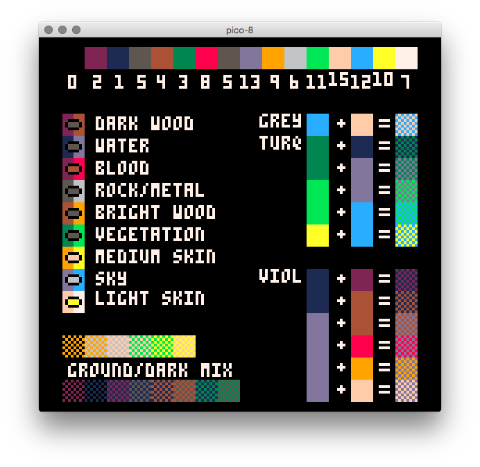
Here's the link to the source files:
https://github.com/underscorediscovery/db-pico
You can also ping me on twitter, http://twitter.com/___discovery

nice!
DawnBringer actually made a palette analyser for grafx2, here is what it returns for the pico-8 palette: (if it adds anything to what you already did)


oh man, the palette by DawnBringer is lovely. I looked at a number of 16 colour palettes but somehow missed it. The property wish-list is quite similar to pico-8's, except that I favoured saturated garish colours over real-world ones as I felt it suited the mood of the console better.
I am still open to tweaking colours if they don't badly break existing carts. For example, the dark purple could perhaps be less saturated and still do the job of being the only warm dark colour. Still not sure about that. I'd also love to hear general criticism of the palette (don't hold back!), even if it's too late to make large changes.
There is a possibility that pico-8 will support arbitrary palettes in the future (through -- I dunno, a video widget extension?) But I think it would be nice to keep it fixed for a while at least, as it plays a large role in the console's identity / feel, and also to make exploring the restrictions more of a shared experience.
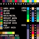
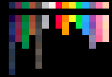
If you're curious, here's the pico-8 palette with a recent history of some variations I tried.
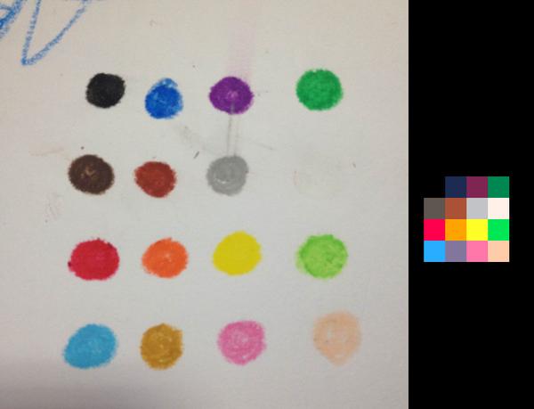
I also discovered that my son's box of crayons is remarkably close, except for replacing the indigo (#13) with a sandy brown.

General disclaimer: I haven't made a lot with pico-8 palette specifically yet,
nor am I an experienced pixel artist with a lot of experience with palettes and colors in practice.
The reason I wanted to graph it similar to what DawnBringer did was specifically to see the spread of high and low in terms of value and contrast. I like the saturation and brightness of all the colors, except the one : The yellow.
I was particularly bothered by the fact that it isn't really connected to the others. It doesn't blend well to my eyes because it's such a bold, near full color primary. Palettes are often going for cohesion, I feel the yellow particularly is pushing it's way out. The green is just as bold, but it gets dragged down by the things around it. The analysis placed it further from the right hand brightness perception too, because of that.
Looking at the updated analysis graphs - it sort of confirmed my concern with the yellow at least to my own mind. The white and yellow are on the same axis perceptually. Also, every small example block that uses the yellow is thrown off to me, by it's contrast. If I blur/cross my eyes or look at the image out of the corner of my eye, the yellow isn't cohesive because it's overpowering everything around it. It's dominant, when I don't think it should be. Even the image you posted of the crayons, the yellow there is much closer to the tan, orange, and beige than the super saturated one, for blending.
If I had any concrete change to suggest as is, it would be to change the yellow so it sits closer to the beige or, "moves left on the perceptual graph", in between rather than maxed out. I think it would better gel with the rest of the colors and not overpower them.
The main reason I made the thread is that I am sure there are infinitely better pixel artist and palette artists around here that could give me better understanding of why it works in practice, and if my understanding is off.
On the charm: I agree with the idea of the palette being unique to the console, and a cohesive feel to the games for it like the old consoles. I don't think that's something to change for sure.
Otherwise, I do agree that the darker purple + possibly the dark blue feel a tiny bit over saturated, but they don't bother me as much, I don't feel as strongly about it.
I modified the palette a tiny amount based on this reply, off the cuff, just to see how it would look according to how I feel about that. It still looks as vivid to me, but feels more cohesive as well. I won't embed this for confusion sake, but here is the modified analysis image. The graphs are not updated, just the indexed color swapped. See the example blocks + dithered mixes for what I mean, but it may also be a bit flatter.
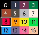
More opinions and feedback very welcome

I actually like the pallet the way it is. I have no in-depth analysis for my opinion, but there you go.

To be honest, I can't remember why the yellow is so maxed out, as other historical versions I have lying around have much less green in them to keep closer to the orange. I guess I was afraid of colours getting muddy in order to be mixable, but as you point out, a darker yellow still gives a nice vibrant impression in context. And getting better separation from the white is nice too.
I found an earlier palette test with the current yellow and another candidate, and added your suggestion on the left. Somehow I quite like keeping the red maximum -- when ramped from orange to white it otherwise comes across as too green to my eye. And I don't mind so much that the yellow can't easily be used as a green highlight. But either of them work better than the 0.1.1 yellow without destroying Chode.
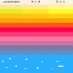

@UrbanMonk
I like it too :> I view changes like this as being like adjusting EQ levels on an existing recording to address subtle use-cases, to serve the desired overall impression rather than alter it.

@zep
The palette I'm referencing is 0.1.1 for reference, I assume 0.1.2 is the upcoming version where it may potentially be tweaked?
I think the saturation as a whole is quite great, though in that image.
That example is interesting too, due to the proximity of the bands. The green tint and the less saturated feel to me comes from the yellows next to it (if I cover those with my hand I don't see as much green)
BUT for that suggestion I made above - remember I just picked at random before.
I will use your reference as and try something that isn't as off the cuff, and add some darker bands because the darker saturations and ranges will also influence how it perceives a bit.

oh, yep -- the one labelled 0.1.2 is just another candidate yellow. Will play around with it a bit, but it's looking hopeful in existing carts I think. Good point about the left colour's comparative greenness, it certainly does read differently in context and against other colours.
Incidentally, I tried messing with the dark purple again and remembered why it needs to be reasonably saturated -- it pairs quite well with the brown, red and pink, and otherwise feels a little detached.
I think the way pairing works in pico-8 is a little different from typical pixel art palette design, as there isn't as much value using dithering or thin lines of replacement colours because the resolution is so low. It's quite difficult for one big fat pico-8 pixel to get away with being a different hue when trying to suggest a gradual change in intensity, for example.

Alright!
I did some experiments too, using your reference.
I first spread them out, and then hid both "0.1.2" and "0.1.1" from the image,
I reset my pillar to 0.1.1 yellow and then tweaked it in context of the scribbles on the right.
This was just to get a feel for something I'd pick if I was being conscious of the choice.
Funny enough - the hue I changed down by 5% - exactly the same as you did.
Once I unhid your 0.1.2 version they were exactly the same hah.
Further, I went on to make a modified, ordered palette (according to the original analysis order):
This might be useful in color swaps if you want to try and use tools to explore it in other similar work.

After that, I used grafx2 and PS to migrate some pixel art I found to this modified palette.
Note that the trees with the yellow highlight still work, and are quite saturated but would fit well overall.
The same applies for the second mockup with the grass area.
Here is where I landed with this experiment and this yellow:
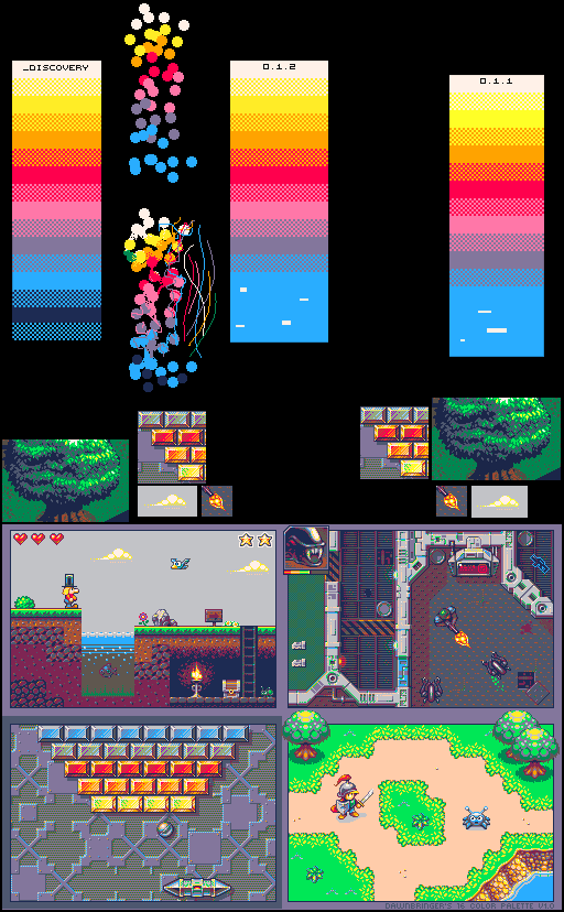
Note: cropped things under the right hand side (0.1.1) yellow are a too hot, especially in context, like the fire is blown out, the cloud has no real definition of form. On the left hand side (0.1.2) the cropped blocks have a lot more depth to the range, and overall.
The whole of the bottom mockup is using the 0.1.2 palette, but if you replace the yellow in the DawnBringer mockup at the bottom with 0.1.1 things become a lot less cohesive, to me.
Sources
The bottom image is from the original DawnBringer thread - but modified to use the 0.1.2 palette.
I threw in some white pixels on the edges of some yellows to see if there was a difference in contrast (there is).
The tree I found but cropped a section away, the original lacked a source unfortunately.
If you know where it's from, I'll edit the source in.
SO
I really prefer the second yellow, the 0.1.2 one. I'd still be curious to hear other opinions than my own - but it sounds like you're also seeing it in a similar way.
Oh and thanks for the interesting discussion, none the less!
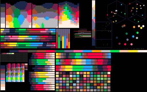
EDIT: Here is the analysis now, the yellow sits in between on the perception chart which is what I was aiming at:
Bonus
I found this rather interesting example of material definitions using the DawnBringer palette:
It was in this thread

If I have time to try and convert the concept to the pico palette for my own curiosity I might, but figured I'd leave it here for interesting reference none the less.

I'm against the palette arbitrary stuff unless it's changed only by hardware register peek/poke style commands. I don't think it should be an obvious out-of-the-box command, in keeping with the spirit of the virtual console. EGA had a default 16 colors but it was capable of 64 colors that rarely any game ever used since of the lack of standards on the extended palette (from my understanding?). However, if you kept it in, making a hardware change to the RGB value (i think a 0-F for each R,G, and B is sufficient and about correct!) would still limit to 16 colors and still achieve the feeling of 'hacking the console' even if it's sort of an 'undocumented feature'. ;)

This is great, it will help get a clue about the palette and how to make better use of the limited colors.

If you could peek/poke the palette like that, though, then you'd expect to be able to have more than 16 colors on screen at once by changing the screen palette mid-rendering... except that probably wouldn't work because of the way the rendering pipeline is actually set up...
Therefore I'd say it could be better to have a permanent palette swap as some form of cartridge-wide configuration, like cdata or something, but then you wouldn't be able to change it when you switch scenes...
And of course, if we're peeking and poking values anyway, it would be much more fun to do it like the old palette bug, where we have specific alternates zep laid out to be used. A deep saturated blue, a deep saturated purple, some darker colors, some lighter colors. But still a limited palette of (let's say) 24 or so total colors, of which you can only use 16 in the cart.

@_discovery: would you be so kind as to let me know how I can run the DawnBringer scripts in Grafx2? Thanks!

I actually really like the Pico-8 palette, except for maybe the red. It's growing on me, but it seems like a somewhat questionable choice for the shade. It looks more like hot pink or magenta than red. That having been said, it's growing on me and I also feel like it adds some style to the palette that wouldn't be there with a traditional, "plain 'ol" red. Just throwing my thoughts out there.
[Please log in to post a comment]


