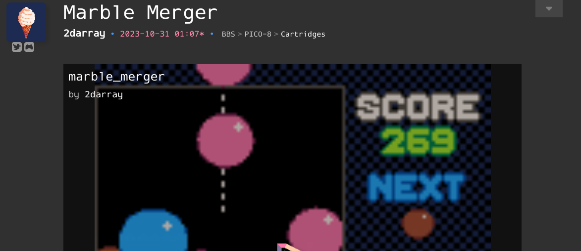
Cart preview PNG img elements could really use the css declaration image-rendering: pixelated
Now:

With image-rendering: pixelated:

This would be a better reflection of the games' actual look, and even makes them a bit more appealing to play IMO. It's a pretty simple change to boot!
Thanks for reading!

I think it looks good the normal way, because the blurred one really shows that its only a thumnail rather the actual game. Maybe its only me but I always confuse the clear one thinking the game is already running.
[Please log in to post a comment]


