


Super original, I'm trying to turn it into a pico-8 custom font, but there are a few problems :
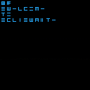
The base grid is 5x5 pixels, plus some for spacing...
I'd say 2 pixels between lines, and maybe 3 between characters ? Words like tail or tiara are hard to read, but too much spacing is also problematic. I thing printing over a white/grey checkerboard would increase readability a lot, but you wouldn't be able to simply use print("Text") any more.
Other problem, what to do with capital letters. Pico-8 has a max of 8 pixel width, so at best we could add three 2pixel wide horizontal lines for the capital letters, but that would break the mono-space aspect of the font. Alternatively, we could set the graphics of every capital letter as the three horizontal scratches and do print("Ttext")
qu is another headache. I'm guessing the simplest is to do print("qest") to print quest, but that's another burden to put on the user... Alternatively, we could define q as a no space letter, like an accent, and have the following u go over it, but that would mean using the u without the diagonal when the one with it is a big win in overall readability.
Another question is how wide should spaces be ? Like the rest for mono-font, or a bit wider for better separation of words ?
Lastly, how are numbers written ? if it's a huge line with diagonal ticks, how do you write 1009 for example ?
Simple alternative would be to use 7 segment display for digits, but that would look very out of place (techno dragons ?), and "1" and "a" would look the same... maybe just keep the pico-8 digits...
thoughts ?
Yeah, it’s quite a “half-baked” idea tbh… ^^;;
At first I wanted to use a custom font on GB Studio, but was feeling overwhelmed by how tile switching worked contrary to Pico8’s native design.
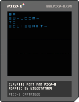
This is just a code snippet for an old neography which I personally liked, not a conlang like Toki Pona; the originator of this coded font said in subtextual context, this secret code is not 100% perfect (even the numerical system varies from each .TTF fan creators).
As it explicitly uses a 3x3 design, I’ve felt it was efficient to use the 5px square shape for making the most simplest grid.
Other that the previous problems you’ve already mentioned, idk much more on what else to say or do :/ (that’s why I’ve not put it out as a “full-fledged cart”)
Anyway, anybody’s free to mod the tiles if needed while respecting the overall symbols designs as formatted…
[Please log in to post a comment]