Hi all,
I decided to create my own take on the PICO-8 Cheet Sheet. 👨💻🖼️
Inspired by @LightBWK's version - I wanted to try to make a 4K one using a clean, modern look.
Light Version
.png)
It was also important to me to have a matching "Dark Mode" variant, as that's my go-to style 🕶️
Dark Version
.png)
Main Features
- 🖥️ 4K (3840x2160) Resolution
- 🔠 Clear, Monospaced JetBrains Mono Font
- 🔷 PICO-8 API up to v0.2.5g
- 🎨 Full PICO-8 Palette (inc. "Secret" cols)
- 🦓 Matching "Light" and "Dark" variants
- ⌨️ All Major PICO-8 Keyboard Shortcuts
- 🖌 FILLP() Mask + Glyph Patterns
- 🔄 Turn-Based Angle + Trigonometry Primer
- 🈂️ Full Character Set
- 😺 Glyph List + Constant Values
- 🐛 System + Debugging
- +More!
Please let me know what you think (...especially if you spot any errors! 😬)
Below you will find links to high-res .PNG + .PDF exports of my cheat sheets, enjoy! 🤓
Downloads
- PICO-8 Cheat Sheet (4k).PNG
- PICO-8 Cheat Sheet (4k).PDF
- PICO-8 Cheat Sheet (4k - Dark).PNG
- PICO-8 Cheat Sheet (4k - Dark).PDF
Sources/Acknowledgements
- Enhanced PICO-8 cheat sheet by @LightBWK
- PICO-8 Manual
- Pico-8 API Cheatsheet (iiviigames)
- Pico-8 API Cheatsheet (neko250/Carlos Aguilar)
- Orig PICO-8 Cheatsheet PDF by @ztiromoritz
- Nerdy Teachers PICO-8 Guide
- PICO-8 Wiki
- JetBrains Mono (font)
- Canva (designed with)
Support
Change History

this looks very nice! dark mode and all the images are excellent additions. I have two personal reference images that look incredibly similar to the two font images in the bottom-right :D
I have some idea for changes, if these are helpful to you:

Thanks for the great (+thorough) feedback @pancelor - this is very helpful. 🙏
Will digest this and incorporate into the next update.
Alas, I'll probably have to compromise due to limited space (trace was cut prev for this very reason). But I'll be happy if I can find a good balance of including all the "essentials" (e.g. for 80% of the audience) - anything more I'll consider a bonus 😉
UPDATE: I ended up re-arranged things and actually squeezed lots more in! 😊

Thanks! Also....
2 typos I noticed:
- There is a forward slash after peek2(addr) in memory functions
- Also in memory functions, cstore and reload have and ending square bracket, without the beginning one.

Hi!
I'm sure this has been asked millions of times: what are those constants in the bottom right corner of the image? (e.g. N = -25792.5)
Thank you!

Hi @Morusaka,
Basically, the glyphs (A..Z) along with having a symbol/picture when used in a string ALSO have a predefined numberic value.
So, if you do...
str="♪" print(str) |
...you'll just see the glyph/picture.
But if you use the glyph itself like a constant...
num=♪ print(num) |
This means you can do things like...
if(btnp(❎)) print("fire!") |
...which is the same as doing...
if(btnp(5)) print("fire!") |
...because ❎ has a constant value of 5.
Hope this helps explain things a bit better 🤓

Thank you @Liquidream for your reply!
I'm fairly new to Pico8, but this makes a lot of sense, at least for LEFT, RIGHT, UP, DOWN and the other 2 buttons.
Even 0.5 (the letter A) has some meaning on its own (even if I would argue its is much less readable than 0.5), but where all the other constants come from? They don't seem to encode any kind of bit pattern, neither mathematical constants... maybe something that has to do with notes frequencies?

You're welcome, @Morusaka.
"...where all the other constants come from?"
TBH, that's one for @zep (PICO-8 creator) to confirm - as I'm afraid I don't know.
I believe they are linked to the fillp pattern presets,
but I'm not 100% sure (nor could I confidently explain it), sorry.
Perhaps someone else here can? (as I'd like to know also) 🤷♂️

that is the right answer!
just like ⬆️ or 🅾️ are assigned numbers with meaning related to btn/btnp, other variables defined with 1-character names like ▒, ▥, 🐱, ♥ are assigned numbers which work for the fillp function to create patterns looking similar to the characters themselves. in other words they are pre-defined shortcuts that are useful in tweetcarts for example.
about fill patterns
doc: https://www.lexaloffle.com/dl/docs/pico-8_manual.html#FILLP
pattern: catalogue https://www.lexaloffle.com/bbs/?tid=52986
bits and binary: https://www.lexaloffle.com/bbs/?tid=38338

Thank you for this. Beautiful and wonderful layout!
Just FYI, I noticed Mute/Unmute is shown as "CTRL-M" instead of "CTRL+.." like everything else.
Thanks again @Liquidream

@kozm0naut Oh well spotted! What a silly typo 🤦
Will get sorted in next release (+thanks for the kind words!)

@Liquidream any reason why the pdf's link to v1.4 and the png's still to v1.3? :-)
I spotted that under Controls for P1 the arrow icons match the wrong colors.
apart from that: great work. immensely helpful.

Thank you for this. As a beginner, this will be useful for reference. Every
detail is clearly illustrated.

@Liquidream spotted another (very minor) issue, the face character (shift+M) is shown as having a numeric value of 21845.5, but this is the value for the shift+Z character, the face has a value of -24351.5
Thanks again and Happy New Year!

I'm getting an error when attempting to download the latest version..
"Sorry, you have been blocked
You are unable to access lexaloffle.com"

I am also getting a error message when trying to download the png.
"Sorry, you have been blocked
You are unable to access lexaloffle.com"

@Liquidream
I think if you remove the parentheses from the file names, it wont look like an injection attack to cloudflare anymore which should in theory allow us to download it

Thanks all for bringing this to my attention.
I've flagged this up for @zep to be aware of (in case other ppl are affected).
In the meantime, I'll try to re-upload the content later (at work atm) with adjusted filenames - e.g. removing parentheses (thx johan.win), as it looks like this could be the culprit (unless Cloudflare rules get updated in the meantime).

It was indeed a cloudflare rule causing this -- well surmised! I added some extra filtering a few days ago to handle a high volume of malicious requests, but just now added an exception for user files until I can get some more reliable rules set up.
It should be accessible to everyone now // try ctrl+shift+r to force a cacheless reload if it doesn't work the first time.

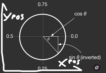
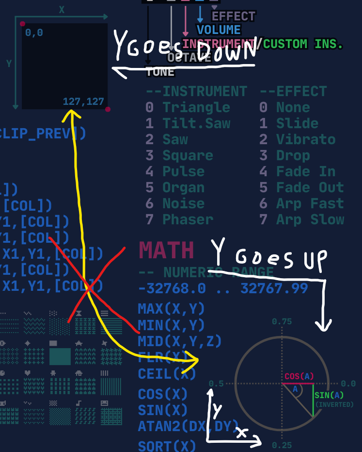
Another error: the circle depicting SIN/COS values assigns 0.25 to down, and 0.75 to up (i.e. clockwise) but this is wrong; it's the other way around. (i.e. counter-clockwise)
On the more minor side, the layout of the buttons has O to the left of X. While this is a common depiction of the PICO-8 controller, seeing as Z (AKA O) and X (as itself) are the most commonly used inputs on a keyboard, and Z is to the left of X, but despite this the KEYCONFIG command depicts the opposite, with X to the left of O.
Lastly, I think the comment in the line PALT(COL, T) -- TRANS(BOOL) doesn't really clear things up, and (at least to me anyway) makes things more confusing. At least in my mind, it takes a little bit of thinking before I realize TRANS is short for 'transparent' and not 'translate' or 'transgender' or something else that doesn't have anything to do with what the function actually does.
Putting all that aside, I'm glad the cheat sheet is getting an upgrade! The previous one was last updated in October 2018, for 0.1.11g... yikes :P. Plus the extra additions like the STAT(OH_GOD_WHICH_NUMBER_IS_IT_I_FORGOT) values are very much the kind of thing you would need a cheat sheet for, so I'm glad that they're in this one now.

@Kaius: Thanks for the suggestions.
I took the final reference for SIN/COS from the PICO-8 wiki, which is maintained by several well-respected people in the P8 community. So, unless I'm misrepresenting their reference (or they update their definition) - I'm happy with my depiction.
Re: controller layout - by your own admission, there are already differing views on this (gamepad vs. keyboard). However, PICO-8's built-in menu also maps to O to the left - and as that's available in every PICO-8 game, inc. exports (not just in keyconfig, which I agree is somewhat contradicting), So I happily settled on that, and will likely keep it that way until Zep says/updates it otherwise).
Re: the PALT(COL, T) -- TRANS(BOOL) - I have no idea why you brought any topic other than transparency into this conversation, but I agree it's inconsistent (tried to convey too much in too little space). After reviewing again, I'm pretty happy with it - as it says what the function does, and what options are, in a tiny space.
Thanks for checking it out - hope you find it useful someday (warts and all) 🤓

@Liquidream On the sin() diagram...
Tl;dr: The wiki is either wrong or misleading. (From what I can tell, a little bit of both, but what it's wrong on is irrelevant, and only the part it's merely misleading on is actually relevant.) 0.25 is up, that is how it works in math where a bigger Y value goes up, PICO-8 has both an inverted sin() function and has bigger Y values go down, creating a double-negative that cancels itself out, so in PICO-8 0.25 is still up, but the diagram is based only on the inverted sin() function while still having bigger Y values go up, creating a diagram that can very easily be taken out of context. Click HERE for a P8-edu cart showing that 0.25 is indeed up.
Long answer (and I mean LOOOOOOOOOONG, sorry, there are a few quotes I needed to analyze and a couple of images I needed to post):
Again, I apologize for the length. I did have a couple of other counter-arguments with regards to the controller diagram and transparency comment, but this post is getting long enough that I'm worried I'll run into a character limit if I keep this up, and those points were quite minor anyway so I don't feel the need to fight so hard on those.

I'll agree that I have always found this confusing and counter-intuitive about the wiki page. @Kaius I believe you are free to edit the wiki if you feel it could use clarification.
Also, I wasn't going to mention this but if another change is in the works, it's worth noting that the P1 directions are still shown in the wrong color (and order if going by l,r,u,d which I think is worth following all things considered).
Thanks for the ongoing updates @Liquidream! I have this printed out at my desk and use it just about daily.

@Kaius: Thanks for taking the time to explain your point.
I would echo @kozm0naut's suggestion of submitting an edit to wiki - as it does sound like there's room for greater clarifity on this.
Either way, I'd be very happy to update the cheat sheet with whatever gets decided as the best visual representation going forward.
@kozm0naut: You are very welcome, glad to hear it! ☺️

As previously mentioned the P1 controls are in the wrong order, for some reason they're shown as UDLR instead of LRUD. The color is correct for the 4 positions, but the direction shown in each position is wrong.

Thx Admiral Coconut, I've already got that fixed in the next "draft" version (along with a couple of other tidy-ups).
Just waiting on confirmation of the SIN() discussion above before doing another release.
(cc @Felice / @dddaaannn)

I should have started off by saying off by saying thank you for this incredibly helpful resource, and for continuing to improve it. It's the single most useful reference tool I'm aware of, and these very minor imperfections don't detract from that at all. I really appreciate your work on it.

@Liquidream @Kaius is correct about the intent of the diagram in the wiki: the f(x) axis in the diagram is up-positive. The diagram does not represent the Y pixel coordinate plane, and is not supposed to. It explains the results of the function, not subsequent use of those results in graphics applications.
It's important to know that sin() uses both unconventional input (angle percentage of the unit circle) and unconventional output (sin() negated). In the specific case where you then use sin() as a factor of a Y coordinate, you also need to know that the Y pixel coordinate plane grows downward, which is why it's convenient that polar-to-Cartesian conversions in PICO-8 are inverted vertically.
When I wrote the wiki explanation, I did not want to conflate these two concepts in a single diagram, and felt that the official documentation at the time was doing readers a disservice by hand-waving the double-negative part. (The official docs have since been improved.) I agree that the wiki explanation could be improved by adding a labeled f(x) axis to the diagram, moving example results closer to the diagram (Fandom appears to have added an advertisement above the Examples section, making it harder to see), and perhaps adding a new section explaining how this applies to using sin(x) as a factor of a Y coordinate. The atan2() page could be similarly improved, and the inverted-Y stuff maybe explained on a dedicated page that they both link to.
You'll have to make your own call for what's right for the quick reference. You could add an up arrow head and "+"/"-" to the top and bottom ends of the vertical axis, and maybe nudge or relocate the input values. IMO, given that the diagram is presented in the abstract and not in terms of screen coordinates, it should maintain its current orientation.

Thanks @dddaaannn for the prompt (+detailed) response and confirmation of the Wiki's explanation, much appreciated. 👍
Will give it some further thought before updating the Cheat Sheet. 🤓

Dude thank you so freaking much, I've been using the light mode one, the dark mode one is an eye saver!

this is great. Have u one with black background and white font?

Thanks all for the kind words 😊
@andykenobi: I'm afraid not. I decided to make my "Dark" mode with less contrast out of personal taste. Sadly, maintaining two styles is already quite time consuming, so I won't be able to add a third.
(You are welcome to tweak a copy to your own tastes tho)

Might be a nitpick, but I think the top-left and bottom-right pixels on the screen should be marked as squares where the actual are. These circles in the top-left and bottom-right of the respective pixels seem confusing to my mind.
[Please log in to post a comment]


.jpg)


