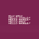
Five free fonts!
Need a small, legible, variable width typeface?
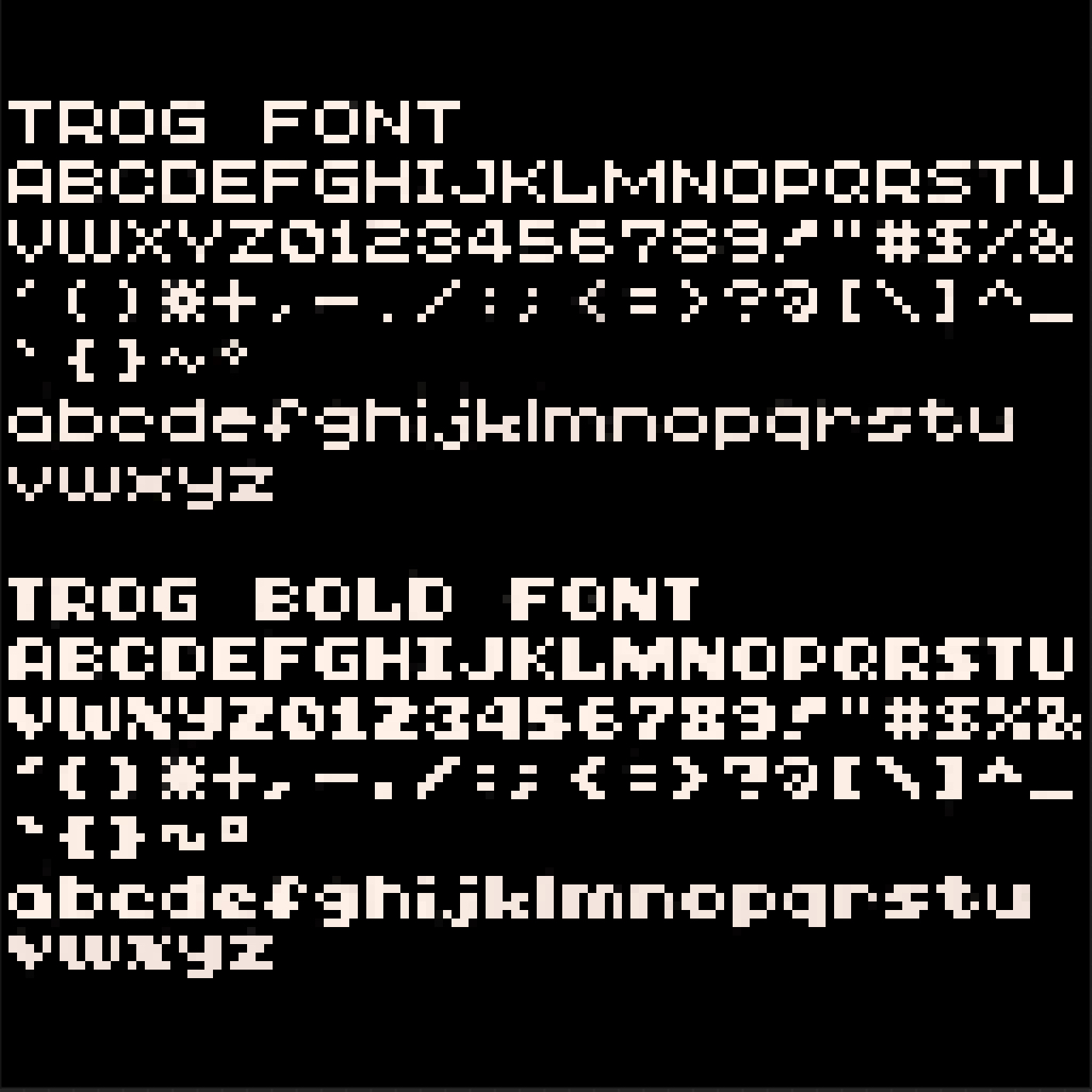
Trog Font is a base 5x5 font which features upper and lowercase (Puny Mode) glyphs as well as all of the default Pico-8 Japanese characters with adjusted widths. From a 1-pixel wide “i” to a 7-pixel wide “M” the viariable width property allows the glyphs to exist in their most natural forms (for a 5 px high font, that is).
Need something chunkier?
Trog Bold has heavier versions of all western characters and symbols (and also contains the same default Japanese characters as Trog Font).
Need to shout?
Trog Caps uses all of the base Trog Font characters but replaces the lowercase Puny Mode characters with all caps Trog Bold characters - perfect for emphasizing important words.
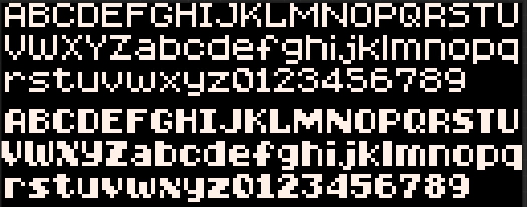
New - 6-pixel high Trog Tall and Trog Tall Bold
Slightly taller versions of the primary fonts with less compressed lower case letters.
Easy to use
Just un-comment out the font of your choice and use \14 in front of your text. That’s it.
Special thanks to @zep for Pico-8 in general and for enabling variable width fonts, to @SmellyFishstiks for his most excellent variable-width font editor used to create these fonts, and to the lovely and talented people of the LazyDevs Discord for their encouragement. ^_^
Credit me if you’d like, or use the name “Trog Font” in your code comments, or tag me in your cart post - I’d love to see the fonts in use! Enjoy!
NEW - TROG TALL & TALL BOLD FONTS:
Notes:

I realized afterwards that I hit a Creative Commons license which said that this is not okay for commercial use and requires attribution. Please feel free to use this for commercial projects too if you’d like. Attribution is not required either, though I’d enjoy it if someone did so. The fonts are 100% free for any use. ^_^
Edit: @v Done!

I think you can edit the post and/or the cart to change the license!

@Heracleum Thanks! They all were fun to work on. 😁
The new version of the cart now features two additional fonts - 6 pixel tall Trog Tall and Trog Tall Bold.
The preview text I had left over from the previous version is laid out a little too close together, vertically, so when one loads one of these two new ones it will be placed in an awkward manner, but they should work fine otherwise. I might need to create a better preview layout if I add any more in the future. 😅

These are really nice fonts! I've been looking for something more like a classic arcade font to use in my game and your Trog Tall looks perfect. Is it possible to paste these fonts back into your editor to modify them? When I convert the string back to hex code and try to paste it over the custom font memory (5600) nothing happens.

@Conor Here is a PNG of the Trog Tall sprite sheet that can be imported into @SmellyFishticks original variable-width editor cart post found here: https://www.lexaloffle.com/bbs/?tid=51138
[Please log in to post a comment]


