the recent release of PICO-8 Education Edition proved that the PICO-8 editor can work on phones, but
> Sorry, touchscreen typing is not available ~ please plug in a keyboard!
i know why PICO-8 doesn't support touchscreen typing:
P8SCII is special, so it needs a special touch keyboard to work.
the standard phone keyboard has no [ctrl] and [tab] keys, that are important for PICO-8 programming:
- [ctrl] is needed for shortcuts like [ctrl]+[s]=Save or [ctrl]+[g]=Grid
- [tab] is needed for code indentation
(you can do this with spaces, but using tabs is the right way because you can change the tab width in Config)
also, using [shift] in PICO-8 is much different than everywhere else:
unless you choose to use Puny mode, [shift] switches the letters to glyphs instead of uppercase letters.
so showing that on the keyboard really helps.
here is my PICO-8 touch keyboard draft
(in 1× scale, so that it can more easily be worked into an actual PICO-8 app)
default state of the keyboard
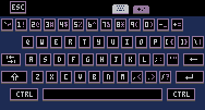
default state of the keyboard; [ctrl] key activated
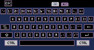
default state of the keyboard; all keys pressed
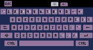
glyph keyboard ([shift] key activated)
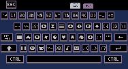
glyph keyboard; all keys pressed
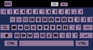
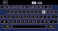
puny font keyboard
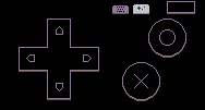
controller
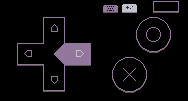
controller; right arrow button pressed
controller; all buttons pressed
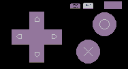
this is just a visual draft, so we need testing to confirm that it's comfortable to use.
also, the images are wider than PICO-8's screen width of 128px, which i think is okay because real keyboards of retro computers always looked more crisp than their screens.
if anything, the touch keyboard draft looks not crisp enough.
we could use the pixelated keyboard for testing the form factor, because it's easier to edit than vectors.
but once we know the final form factor, we can trace the pixel image in a vector program to get a realistically crisp keyboard.

Hi @Sosasees.
Gold star to support this idea.
If you don't mind its age I wrote a fairly comprehensive Pico-8 keyboard HERE:
https://www.lexaloffle.com/bbs/?pid=30679
However, YES I would much prefer a true non-restricted by pixel keyboard overlay for my cellphone and Android tablet.
Also for the joystick buttons please add AUTOFIRE and a small SWAP.
The autofire does just that, it is as if you are rapidly pressing either button 🅾️ or ❎ rapidly.
The "swap" button is to swap the buttons so O is X and vice-versa. It would also appear to be slightly LIT up to show it is active.

@dw817 the 'controller' tab especially
needs as little clutter as possible, so that it can be used well on a small touchscreen
so the options 'SWAP 🅾️/❎' and 'AUTOFIRE 🅾️' and 'AUTOFIRE ❎' don't belong on the controller layout, but in the options menu in the pause menu
these options would fit in a 'CONTROLS' submenu. the current 'CONTROLS' option in PICO-8 0.2.5e could be moved to 'CONTROLS' → 'TEST'. so the new OPTIONS menu could look like this (on touch devices):
- OPTIONS
- SOUND:ON
- VOLUME: ▉▉▉▉▉▉──
- CONTROLS
- TEST
- SWAP 🅾️/❎:OFF
- AUTOFIRE 🅾️:OFF
- AUTOFIRE ❎:OFF
- BACK
- BACK

i researched old microcomputers to know how old computer keyboards look like, and how keyboard fonts compare to the screen fonts
this is what i found, that is interesting for designing PICO-8 touchscreen keyboard:
- some keyboards are more colorful
- some keyboards are simple white-on-black or black-on-white (example: Commodore 64 keyboard)
- some keyboards have contrasting borders on their keys (example: Atari 400 keyboard)
- some keyboards have multicolored keys (example: ZX Spectrum keyboard)
- every keyboard has a vector font, that can look different from the pixel font on screen
- on keyboard, letters could have different curves than on screen
- letters that have serifs on screen could have no serifs on keyboard
- most interesting, the Commodore PET and Commodore 64 have a set of special characters similar to P8SCII's, and even these special characters are vectorized on the keyboard, with borders around the box drawing characters (examples: Commodore PET keyboard, Commodore 64 keyboard)

i started vectorizing the keyboard, so that it looks similar to real microcomputer keyboards
this one frame took me as long as the original 8 pixel art drafts together, because i had to make a special font — making HD letters that are readable at small sizes is tricky
this raster export of the vector graphic is made at 200% zoom — the smallest display size that i planned:
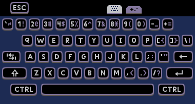

Nice, @Sosasees ! That is a great looking keyboard.
You might make the right CTRL an ALT key or FUNCTION key (A-Z yield █ to ▥) glyph.
I like how you only have one shift key saving space for the CR on the other side.

@dw817 i was thinking of replacing the right [ctrl] key with the arrow keys, since i forgot them in the original draft
what is the [alt] key used for?

ALT key for the IBM-pc, @Sosasees is usually off-limits in most cases. It's generally used to create additional keystrokes you normally cannot get on a keyboard. For instance, go to NOTEPAD and try out ALT 179 and ALT 196 by pressing the numbers on the number keypad without letting go of the alt until you have typed all 3-digits.
You will create a vertical line and a horizontal line.
While code can recognize it, it's generally not a good idea to assign keys to it willy nilly. ALT-TAB, very common, for instance, changes to the next Windows task without having to use the mouse to click the icon.
If you press ALT-TAB, let go of TAB but still hold ALT, you can see all the Window tasks running and can use TAB to go forward or SHIFT-TAB to go back - still while holding down the ALT key.
I think it would make a better key for glyphs that Pico-8 makes use of via SHIFT letters A-Z.
█▒🐱⬇️░✽●♥☉웃⌂⬅️😐♪🅾️◆…➡️★⧗⬆️ˇ∧❎▤▥

i found the list of keyboard shortcuts in PICO-8.
these are the known shortcuts using the [alt] key:
Global
- Quit (Windows version): [alt]+[f4]
- Previous editor: [alt]+[←]
- Next editor: [alt]+[→]
text editor
- Previous function: [alt]+[↑]
- Next function: [alt]+[↓]
these shortcuts are useful, but they might not be useful enough to add the [alt] key to the touch keyboard, because space is very limited
the one of these shortcuts that would be useful enough to add the [alt] key despite limited space is Quit, but
- the Linux version uses [ctrl]+[q] as the Quit shortcut. we could do this in the mobile versions too
- mobile OSes have their own global Quit shortcut, that doesn't use any keys — except the home button on the global navigation bar if swipe gestures for global navigation are disabled
as @dw817 explains in the comment above (thanks), the [alt] key is very useful on PCs. but in a PICO-8 mobile app, it would be useless enough that it only disturbs by taking up too much space
i am thinking of replacing the right [ctrl] key with the arrow keys, because i forgot them in the original draft, and i now think about how they are really useful:
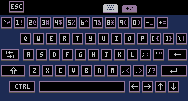

How about this, @Sosasees ?
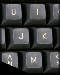
You have sidelined the digits with extra-character, you could do the same with I J K M as was used in the Apple ][ for navigating
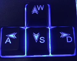
Or W A S D which seems to be the standard today in games for the IBM-pc.
You could super impose arrows there. My own physical keyboard has superimposed arrow keys on W A S and D of course in addition to regular arrow keys to the right of the right-ctrl key.
In all cases youl could make all 8-joystick buttons fully configurable.
Left, Right, Up, Down, 🅾️, ❎, Start, Pause.

The arrow keys you have listed above are in a horizontal line. While they did that with digits for the Sinclair 1000 years ago, it was never very comfortable.

@dw817 these arrow keys in a line are meant for quick use. i couldn't fit them anywhere else on the touch keyboard
if you need to use the arrow keys a bit more intensively, you can switch to the 'controller' tab to use the directional pad

now is the time to think about the right license for this keyboard design, so that i can publish its source files for use by other people, especially @\zep
i can exclude 4 licenses
because anything with 'NoDerivativeWorks' (ND) and/or 'NonCommercial' (NC) is off-limits
this leaves CC BY and CC BY-SA and CC0 as my last 3 options. in easier words, i can choose one of these:
- get credited for my design
- get credited for my design, even in derivative works
- put my design in the public domain
i feel like this is something i should think about and choose for myself

Hi @Sosasees:
You could set it so it has unlimited use - provided it is in the Lexaloffle website. That right there limits so it will not be used commercially.
Umm ... I'm just thinking ... can your keyboard run in Lexaloffle ?

@dw817 unlimited use on Lexaloffle website only, to limit commercial use, sounds bad. i want the possibility of using this keyboard in 15-dollar apps.
also, i haven't programmed anything for the keyboard — i have only made images.
the source images can't be displayed on Lexaloffle — i could upload the SVG image, but it would not be displayed. maybe Lexaloffle supports SVG but not Inkscape SVG

Well now, @Sosasees, now that we have Picotron, you could definitely develop a marvelous keyboard in their 480x270 pixel area.
It is quite possible that Picotron once going, like Pico-8, will not have an onboard overlay keyboard - and that's where you come in. :)
I have in mind a very innovative keyboard of my own design yet I am so busy with so many other projects, I just can't find the time.
Your keyboard is awesome. It's aesthetically beautiful and looks quite functional. Were @zep to accept and add it to Pico-8 with your blessings, I would definitely use it.

today's vectorizations — 2022-01-02
keyboard in default state
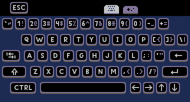
almost the same as before. i just replaced the right [ctrl] key with the arrow keys
keyboard in default state; all keys pressed
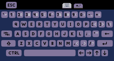
pressed keys have their surface lowered by 1 dip compared to non-pressed keys
keys background
 normal
 pressed
 active
nine-patch
these graphics can be used in 9-patch format
- to draw long keys like [esc] and [tab] and [backspace] and [shift] and [enter] and [ctrl] and [space]
- to make the keys taller than the default minimum height (enforced by the image size) of 11dp — using a config option that could be named 'touch_key_height'
- 'touch_key_height 0' means 'don't add any height to the minimum 11dp'
- 'touch_key_height 4' means 'add 4dp to the minimum height, making the keys 11+4=15 dp tall'

key symbols
i focused on the keys that either
- show 2 glyphs
- or are on a long key
i extracted the variant from the default state.
the images canvas is as big as the key in the mockup
| image | main character | other character |
|---|---|---|
 |
escape | |
 |
grave accent | tilde |
 |
1 | exclaimation |
 |
2 | at |
 |
3 | hash |
 |
4 | dollar |
 |
5 | percent |
 |
6 | circumflex |
 |
7 | and |
 |
8 | asterisk |
 |
9 | left bracket |
 |
0 | right bracket |
 |
minus | underscore |
 |
plus | equals |
 |
left angle bracket | left curly bracket |
 |
right angle bracket | right curly bracket |
 |
backslash | vertical bar |
 |
tab | |
 |
backspace | |
 |
shift | |
 |
comma | lesser than |
 |
period | greater than |
 |
enter | |
 |
control | |
 |
space | |
 |
left arrow | |
 |
right arrow | |
 |
up arrow | |
 |
down arrow |

@dw817 as your image shows, the alternate glyphs would be too invisible.
because shrinking the glyphs doesn't work so well, i changed the color to de-emhasize them
even if i could design smaller versions of the glyphs for when [shift] is/isn't active, just changing the color costs much less design time.
this is especially important because i still have the special characters and puny letters to vectorize for the touch keyboard

Oh I just did a miserable job of shrinking it, that's all, @Sosasees. :)
If the whole keyboard truly is vector, it should appear nicely.
Now most keyboards don't have the characters to the sides anyways, they have them above, like my keyboard and others.

Here is a compact keyboard, the Lenovo ThinkPad. That red dot in the middle is a mouse and yes that is as cool as it sounds.
Separation is an important thing too. Notice how every normal alphabetic key is left and top-justified with space left over.
Examine this for instance.

|
[40x16] |
Compare the two. If you were to shrink the size of that to say appear on a cellphone, the smaller text would be more visible than the larger because of the space between the letters. I took advantage of this when i wrote a programming language for the RG-350 and wanted the text to be visible so I used an 8x8 font where each character was maximum 4-pixels across.

@dw817 said:
> If the whole keyboard truly is vector, it should appear nicely.
maybe it will, but the letters already have to be small on a phone screen to fit all the keys in a row, so changing the colors leaves the letters more readable than shrinking the letters

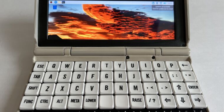
Just for fun here is a Penkesu keyboard. Yes they went way too far to make it compact. :) Where are the digits ?
This website may be of interest:
https://thegamingsetup.com/gaming-keyboard/buying-guides/keyboard-sizes
Additionally I have created a virtual-keyboard for Pico-8, one that scrolls because it is too big for the screen. While I think you can get a bit of a headache if you play with it too long, it was an interesting experiment - to see how it would be.

today's vectorizations — 2023-01-03
letters
i extracted the rest of the symbols from the 'keyboard in default state', that i didn't extract yesterday.
just the letters remained


graphics for the tabs
also extracted from the mockup i made before
| image | thing |
|---|---|
 |
active tab background |
 |
inactive tab background |
 |
keyboard tab icon |
 |
controller tab icon |

today's vectorizations — 2022-01-04
glyph keyboard (when [shift] is active)
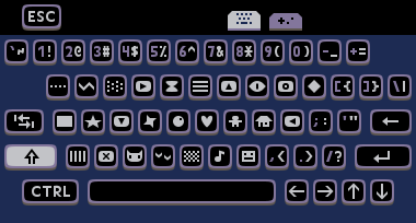
puny font keyboard
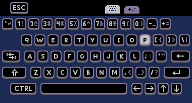
note that the [P] key is lit up, as a reminder of 2 things:
- you pressed [ctrl]→[P] to activate puny mode
- you can press [ctrl]→[P] to deactivate puny mode
this makes making the puny letters on the keyboard look distinct from the normal letters unneeded.
so i made the size change subtle
- so the letters stay more readable
- but that little bit of extra feedback for turning ON puny mode is still there
because the keyboard letters on a phone screen are a bit smaller than the PICO-8 screen letters, the extra readability helps.
the [J] and [K] keys can be lit up in the same way, to show that Hiragana mode or Katakana mode is ON. Because these modes interpret combinations of the English letters (that i already vectorized) as Kana, i don't need to vectorize Kana for the keyboard

HTML & CSS progress 2023-01-05
i started modeling the keyboard in HTML and CSS.
this is the result so far:
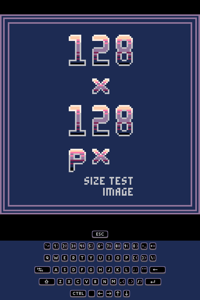
to do next (finished on the next day):
- ✅ scale keyboard to screen width
- ✅ refine horizontal alignment of the keys

HTML & CSS progress 2023-01-06
i finished the tasks from yesterday:
- ✅ scale keyboard to screen width
- ✅ refine horizontal alignment of the keys
and i added the glyphs keyboard
next i will add the 'puny letters' keyboard (update: i did)

HTML & CSS progress 2023-01-07: keyboard states
i added the 'puny letters' keyboard.
i also added the second variation of the 'normal letters' keyboard, that you get if you press [shift] on the 'puny letters' keyboard
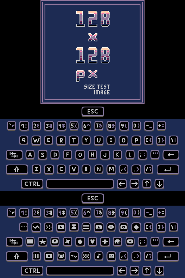
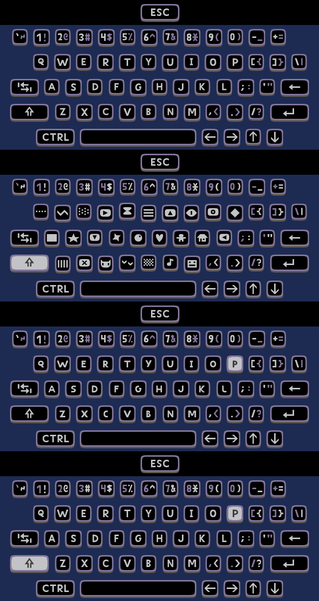
this photo shows all 4 keyboard states on top of each other (from top to bottom):
- 'normal letters' keyboard
- 'glyphs' keyboard
- 'puny letters' keyboard
- the second variation of the 'normal letters' keyboard, that you get if you press [shift] on the 'puny letters' keyboard
next i will think about how i could make the controller in HTML and CSS:


HTML & CSS progress 2023-01-08
i made the touch controller layout in HTML and CSS:

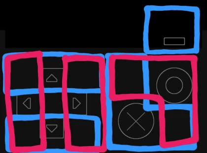
then i played Pico-8 games on my phone's touchscreen, so i feeled how the touch controller is styled, so i know how i should style my own touch controller:
next i will style my touch controller

HTML & CSS progress 2023-04-30
i had a lot of other things to do between the last progress report and now, so i couldn't continue the keyboard project for 4 months.
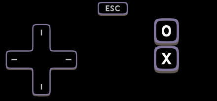
today i styled the d-pad:
the next task is to style the 🅾 and ❎ buttons (done on the next day).

HTML & CSS progress 2023-05-01
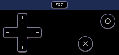
today i styled the 🅾 and ❎ buttons:
i also
- ✅ choose the license (CC BY 4.0)
- ✅ and writing a README
because now the touch keyboard code is ready to be continued by other people.
for my first attempt at publishing the source, i put it on Google Drive.
i might switch the platform if i find a better platform later — the first platform that i think about if using is GitHub.
update 2023-05-05: i moved the project to GitHub — it is no longer on Google Drive.

Great work! Could you release the vector font some time? Would be cool to use an HD version of the pico 8 font in me code editor.

@whistler i will probably not convert this font for typing.
i made this font just for the keyboard,
so i made some important choices that make it look better on the keyboard but also make it a worse font for displaying code:
the most obvious of these choices is that the letters A and C and D are wider than the numbers —
in a programing font, hex numbers should be monospaced, but this choice makes them not monospaced.
even the font format is specially chosen for the touch keyboard:
the key symbols are pictures that are overlaid on the keys, and keys with 2 symbols have both symbols in the same picture.
if i would make a HD PICO-8 font for displaying code,
i would choose some important choices different than with the touch keyboard font.

HTML & CSS progress 2023-05-05: added tab buttons, GitHub
i added the tab buttons to the top row (that only had the [escape] key before) of every keyboard state,
and right-aligned this top row:
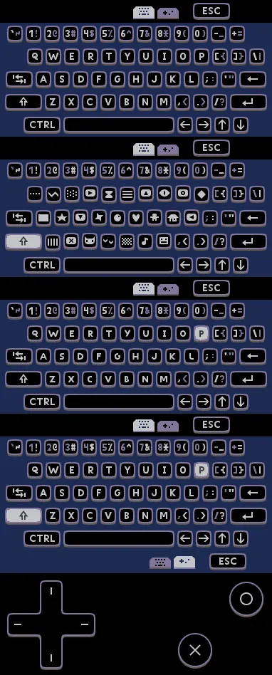
as you can see just above, i put the [escape] key to the rightmost,
so that players can pause the game by pressing the button on the right like in the PICO-8 web player.
i also moved the project from Google Drive to GitHub.


Hi, great job!
I'm developing a chat app on pico8 and it's useless on a mobile device without a virtual keyboard. Can I use your keyboard in my project?

yes, i welcome you to use this keyboard in your projects.
like with any open‑source project, just follow the README and License for your sanity 🙂

Hi @Sosasees,
This is a demo of your keyboard in action:
https://picochat.onrender.com
Please open the link on a mobile device, otherwise the keyboard will not appear (It works fine only in portrait mode).
Oh, I almost forgot. You can find the source for the client and server in this repository:
https://github.com/CarlosEFML/PicoChat
[Please log in to post a comment]


