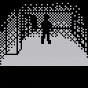
"Hide and Seek" is essentially a more retro version of an RPG maker horror game, including the setting being a high school in a vaguely anime-esque location.
It was designed to be played in one setting, but also has 2 endings, so I put in an option in the pause menu to skip to the branching part, which is about halfway through. The text can be gotten through pretty quickly if you keep pressing x or o, though. Also, on death, the player character is just placed at the entrance of the school with all progress still saved. I felt setting the player back at all wouldn't really be a good idea under the given constraints.
This is a port of my entry to the 4th Nokia phone jam last year. It's one of a couple games I've made in silly ways that I've been thinking would make more sense in pico-8, but that I wasn't sure until recently how to actually fit into pico-8's restrictions. The idea is that most of the entries were going to be light arcade-y stuff, so I felt like doing the polar opposite. I considered including more of the originally planned content that was cut during the jam, but I was already having trouble with how to fit all the images, so I decided not to. However, I did add a few quality of life stuff and rearrange the text to be easier to read.
This game uses 10 cartridges (1 for story sections, 5 for exploration sections, and 2 each for the upper memory image storage in each type of section). If anyone would like to see all of them, an offline pico-8 version (as well as the fake phone version) can be found on the original game page for the jam, here. The "p8.zip" version on that page also has the carts I used for storing the image data.

Good game, @kimiyoribaka.
Please add information on which floor you are in and which room, library, P.E. , main office, cafeteria, etc. That will help the player visualize where they are when exploring ...

@dw817
Done. The floor now shows to the left of the word "objective" while the current room (or abbreviation for it) appears to the right. I didn't add any room info for the rooftop floor, though, since I don't think that would make sense. The rooftop areas on the 2nd floor have "roof" as the room though.

It's definitely looking good, @kimiyoribaka. I noticed some doors you open do not open on a hinge and others do. It might be easier for all of them to be on a hinge to let the player know they have explored that area.
And also to not reset the doors to closed when you climb the stairs - so the player can determine where they have been and have not been even if changing stair levels.
Here is a gold star for encouragement ...

@dw817
Firstly, I guess I should mention that I do care a bit more about maximizing narrative feel than maximizing gameplay feel. The reason the doors don't always have a hinge is that a large number of them feel to me like they would be sliding doors.
Regarding the doors closing, your suggestion makes me curious how far you played. The doors have to have times when they reset, for both narrative and gameplay reasons. Narratively, it's because you're never the only one using them. For most of the game, there's other students there. Gameplay-wise, you're not the only one using them for the 2nd half of the game, and if you play enough it's likely you'll actually see that. For that part of the game, open doors are a sign of danger that I wanted the player to feel. If you see an open door in the 2nd half of the game and you don't remember opening it, that means your character is about to die.
Given all that, I'm not sure how I would handle the doors in a way that fits player convenience, the narrative, and the part where the player can watch another character open doors.

Hi @kimiyoribaka.
Well, it might break convention with you only having 2-colors to the screen, yet you could make a room darker if it has been explored thoroughly. A simple way to do this would be to lay out the x1/y1 + x2/y2 coordinates of each area that is different from each other, music hall, auditorium, cafeteria, etc. And if the player does indeed reach those areas of the room, reaching all x1/y1 and x2/y2 coordinates, IE full exploration, then if there truly is nothing more to find, that room's outline could go dark.
Then it wouldn't matter if the doors were open or closed. I was just trying to find a way to map through the entire school without checking the same area twice. That is the problem with a lot of games where the walls are exactly the same as the floor, it's difficult to know where you've been.
The text does help, however.

@dw817
I have nothing against the idea of breaking the 2-color convention. I was actually considering doing so myself for story emphasis by adding more colors that the text could be, but I decided against it when I realized that I didn't have any part of the game that I actually wanted to use more text variety in. I do think that if I decide to make another horror game in pico-8, it's going to black and white but with bits of red for emphasis. However, I think in that case I would be designing it for that to begin with.
I think the ideas you're suggesting would be really good to consider if another game is made in this style, whether by me or someone else. There's several reasons I don't want to add room markers though. Without writing paragraphs of detail, I'll summarize by saying that the game's cartridges are already pushed to the limit, so I'd need to do a lot of time-consuming reorganization and optimization. At the moment, the first floor cartridge has only like 100 tokens left in space and the game runs at 15 fps (mandated by the code) for everything except inputs while still barely managing to keep from lagging.

Hi @kimiyoribaka. If the ideas seem sound and you want to do them in this cart and the only thing holding you back is code size, you could certainly use Shrinko-8.

Perhaps this is the smallest game i have ever touched but it's really interesting.
[Please log in to post a comment]


