Yo @zep,
It'd be nice if draw_tabs were one of the options in the config command.
Indeed, it would probably be a good idea to do a once-over on the whole config.txt and see what else would be good to add to the command.
I say this because someone noted on Discord that there's no way to make tab characters visible on the edu version. Probably among other things that people on the edu version would benefit from.
Personally, I love visible tab characters, so I want everyone to have the option to try them.
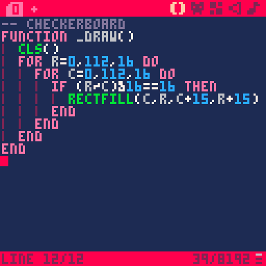
Edit: as requested below, for anyone unsure what I'm talking about, here's a sample image with draw_tabs set to 1 (and also tab_width set to 2). Note the wine-colored vertical line at the left edge of the tab characters, which also neatly masquerade as scope guides.

(Also edit: Woo, BBS thread #50000.)

Would be cool if there were tabs in the Education Edition, there are already some of the options in config for Education Edition but not everything. That would be also useful to try options like this one!

Visible tabs (and whitespaces in general) always make things better.
You have my vote.

I always use that option as on in my config.txt
I didn't realise there was a config command.

@GPI - The draw_tabs flag in config.txt turns on visible tabs. They show up as a wine-colored vertical bar at the left edge of the tab.
It's nice to be able to see where you're mixing tabs and spaces, and it also tends to function as a visual scope indicator, linking e.g. a for to its end vertically:

I really like it. Honestly, I think they should be turned on by default and the user can turn them off if they don't like them. It's not a discoverable feature and most people don't know about it until they see someone else using it.
(I also think tabs should be 2 spaces by default, otherwise what purpose do they serve?)

@Felice I disagree with the tab stop length. 16th of the entire line is too much for me, the vertical bar is enough for me along with external editor compliance. I also think that you should edit the original post to include this screenshot and explanation.
For the record at the first reading of this ticket I assumed you were talking about the code tabs 0 to F not the tab stop.

@SquidLight
By all means, we should all select our own preferred tab width. I just think that starting it out with a width of one, and visually indistinguishable from a space in the editor, is likely to set up both bad habits and bad documents among budding coders.
I think initially setting it to something that is distinctly different from a space is a way to prompt the new user to say either "Oh, tabs are visible and 2 spaces, okay," or "Ew, why are tabs visible and two spaces?" The important part is to give them an opportunity to discover that tabs exist separately from spaces and, after that, that their visual representation can be configured per personal preference.
Remember, the whole point here is that I want it to be easy to change it to suit your tastes. (And more-discoverable wouldn't hurt.)

Something's been scritching away at the back of my brain since you said 1/16th of the screen is too much for you.
It'd only be like using 5-space tabs in real-world editors, where we tend to be scolded by document-width purists for using more than 80 columns. I realize that 1/16th (2/32 or 5/80) is indeed larger than 1/20th (4/80, the gold standard), but it's only a little larger. Given the lack of granularity, it's a pretty close approximation of the gold standard, especially considering the aspect ratio difference—a 4:3 screen with the PICO-8 font might have been 160x120, giving a 40x20 grid with 20 2-space tab stops.
Anyway, point being, 2-space tabs on PICO-8 aren't really that wide. But again, it's down to taste, and that's why tabs are best, because you can load my cart in your editor and the tabs will be set to your preference. (There are more reasons to do with accessibility when using more hi-tech editing suites, but that's outside of the scope of this conversation.)

@Felice I hate with a vengeance the 32 char limit and yes you are right about the 4 char out of 80 (Mostly I put my rulers to 120 now) being percentage wise similar. However this still leaves a lot more characters to express yourself with.
If pico-8 had double the resolution I would probably go with a 3 char tab stop.
I try to stick to the 32 char limit even with an exteranal editor. However this sometimes means choosing worse (In my eyes) variable names.
And yes I'm not against people changing their options. I would probably try to keep the default value when it comes to carts as carts are all about sharing code.

@SquidLight Honestly I'm just pro 2-space tabs, but I don't mind if it never changes from single-space tabs. I just mind that, by default, the difference between a tab and a space isn't visible in the editor, which makes loading a file from someone who doesn't have visible tabs often quite ugly, with spaces and tabs scrambled together at the left side and definitely not indenting properly.

I'm kinda disappointed not to see this in 0.2.5e.
The edu version would really benefit from more command-line access to config options.
[Please log in to post a comment]


