

What horror descends FROM SKIES BEYOND?
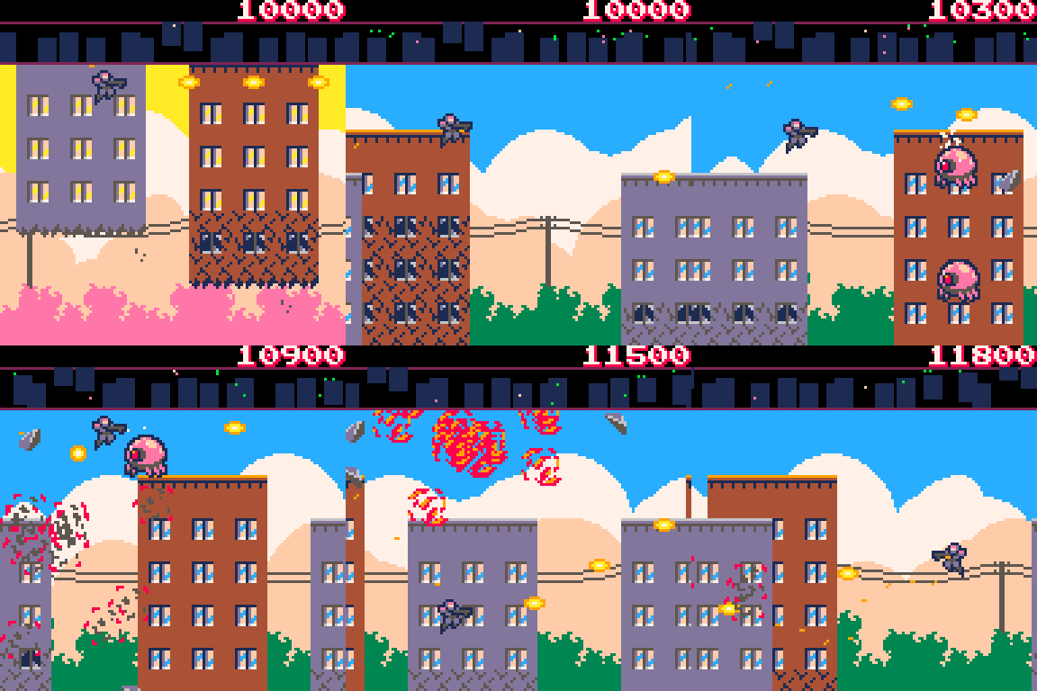
Blistering shooting action in the vein of Defender and Dropzone. Protect the city from literally being lifted in to the sky by alien invaders. Use your radar scanner to find the enemy. Green landers try to carry buildings away, chase them down and destroy them! Bonus awarded for each building left standing at the end of each day.
Click the icon in the top left of the game window for full screen mode.
Controls:
Arrow keys / d-pad / stick - to move
Z key or A button to shoot left
X key or B button to shoot right
Touch screen controls for mobile
Thank you for playing.
Development notes:
This is the first game I've actually ever finished, which includes attempts going back to the late 80s in BBC Basic!
I never used LUA before so had to read up on how to implement linked lists. The game was 99% done this time last year, but there was an NIL object crash bug thanks to some sloppy code that I only got round to chasing down and (fingers crossed) fixing yesterday. It hasn't crashed since and I've played it a lot so... I think I'm good.
If you wanted to delve in to the code you'll find all sorts of weird work arounds for how the game area wraps around, including the map being drawn twice with different x offsets... Many, many fudges and workarounds, but I got everything working exactly how I wanted in the end.

The idea is fun, and it feels good to move around, but maybe take a look at this...

Thanks Maria, I'm right up to the token limit on the game but I did want to optimise and add a few more things (hi-score saves!), so I'll see if I can squeeze in a few more visual effects while I'm at it.

an good take on the Defender genre!
note: the green saucer is next to impossible to dodge/hit - is that on purpose? (like player taking too long to clear level?)

Sweet, it's like Defender and Rampage had a kid!
I really like the sfx and visual effects in particular, and play control is tight.
One gameplay suggestion: it feels a bit odd killing so many aliens who are offscreen all the time, and it would be cool if they maybe lifted the buildings from the bottom rather than the top so there isn't a long period of seeing the bottoms of buildings rising but not being able to intervene.
Note that on the mobile phone web version, the left/right buttons are reversed from what's coded (it's more like the x and c keys than the z and x keys)

@Freds:
Thanks!
I think the green saucer balance problems come from me playing my own game too much and not enough play testing with other people - it is supposed to be hard but beatable, and it could do with nerfing in hindsight.
It's balanced so it can catch up with you if you're flying away from it, which is why I put in the "DANGER" indicators at the side of the screen, to clue you in that it's closing in on you. You can fly away and shoot behind you and whittle it down, but you have to be quick with your dodging. It's firing patterns are random by design - it's aiming roughly at your position but if you stay at the same height it won't always hit you.
Thanks, Rampage was definitely a point of reference, as well as EDF and two old Defender influenced Amiga games called Overkill and Guardian that I used to play a lot of.
Shooting the enemies off screen is partly deliberate and partly a fudge.
Deliberate: to compensate for the narrow field of view from the square screen coupled with the fast scrolling speed. I didn't want to slow the pace down.
Fudge: I wanted to keep the players firing range consistent without seeing bullets disappear on screen when you're shooting in the same direction you're flying in.
With the buildings being lifted from the bottom, I just didn't like how it looked although as a result I've lost that up and down swooping momentum that Defender had... I think the answer in hindsight would be to add a bit of vertical scrolling, but I was trying to keep everything simple. I could make the buildings a bit shorter though to compensate.
I do like the buildings floating up and you can't stop them though - it's a bit surreal and feels suitably apocalyptic.
Regarding the buttons flipped on mobile, if you play the version on itch I actually flipped the button outputs in the HTML wrapper, but I was so focussed on fixing it there that I forgot to do anything about it anywhere else! I need to claw back a few tokens and add a "Button layout default / flipped" option on the title screen - which would take care of different button layouts on pads too.
TL:DR - I need to put together a version 1.1 patch!

Interestingly large graphics, @matt0. The take of a change from Defender in pulling buildings up instead of people is quite creative and animated beautifully to say the least.
Really nice mapping shooter. Gold star.
[Please log in to post a comment]


