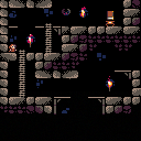
So I decided to go for a platformer... my first in PICO8. Building it on top of my OOP game model (which maybe was not that good an idea...) so it is a code nightmare. Already at version 4 with a few discarded prototypes in the middle and for sure require some cleanup and refactoring... but kind of works and it would be great to start getting feedback.
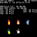
Torches are an application of an old experiment, it's been a while I wanted to include them in some project (and for sure require fine tunning, as they are map cannot scroll as they are poke'd in place with additive blitting)
Still a very early WIP, no screen boundary control so if you fall off an edge you will fall forever :)
I am parking this for a while but I will come back to it very soon, I relly like where this is going
move with ⬅️/➡️ ⬆️/⬇️
hold ⬇️ to crawl
jump with ❎
drop from a platform with ❎ when crawling
activate action menu (currently Psalm selection) with 🅾️ (just the visuals, non-functional)
Last changes:
- Added Coyote time (maybe it's a bit too gracious...)
- reduced the scribe's speed to make it more reasonable (now it is like he lives at 30FPS on 60FPS world)
- var-heigt jumps
- vertical speed adjusted when hitting the ceiling
- debug cannot be toggled in anymore (still there, but key was repurposed)
- added bats (not yet fully operational, they don't "attack"

Hey! Amazing start :D
I like what I see even if I can't do much. I like your sprites a lot, I think they are both cute, and well defined, so you can read them at a glance. Maybe if I had to critique something is the item on the right, I can't distinguish very well if it is supposed to be a table, a vase, maybe something else? But maybe once you flesh out the scene a little bit and give it some context that wouldn't be an issue anymore.
The gameplay feels really smooth. The only issue I found is the crawling animation, looks a little bit choppy compared with the rest, but it could be an issue on my end.
I specially like the fire animation, so kudos to you, adding a little fliker in the background would amp it up to a 10 :D
I like the color palette too, it reminds me to Richard's dawnbringer palette but yours is maybe a little bit more saturated. I think is the same you use in other games you published already, right? Cool palette :)
Good job! I'll be waiting to see future iterations!

Thnx @boraka! This is still a very early wip... the "table stand" is probably more obvius with the actual pick-up on top (now it has it, the base game entity for pick-ups is added in this last iteration, but it is still dumb)
Still need to adjust a few things with the animations and speeds, first plaformer so I am learning the ropes here. That animation is 2 frames only and I was applying factional speed while crawling... it's got a little bit better but probably needing some extra work
Color palette is not something I keep btwn projects... this one I used (with some of the tiles also) in a test that ended up somewhere in the forum or Discord, cannot remember :P I normally build my colors on the fly as I need them
Fire animation is not an animation at all... Frankly I am quite surprised it looks so good, it is an application of an old experiment I did a long time ago with square particles and additive blitting (code is a f*cking mess)
[Please log in to post a comment]


